Did you know that a signature color can improve brand recognition by as much as 80%? In a competitive market, brands have to use every resource at their disposal, if they wish to prevail in their niche. Out of all the possible solutions, logo design and the color scheme are perhaps the most important. Why exactly?
Due to an oversaturated market, brands must bank in on making a killer first impression. A visual approach is by far the most efficient method, as it engages the human mind much faster than written words. To maximize your branding efforts, you have to use knowledge based on logo design psychology and color theory.
Create your logo with a purpose
Perhaps the most important facet of logo design psychology is the motivation behind the logo. No matter which shapes, colors or symbols you use, at the end of the day – they are all subject to the story behind them.
Use Design Templates to create Brand assets for your business! Read more about them here.
Before you go start turning your idea into reality, ask yourself these questions:
- For whom am I creating the logo?
- What emotions do I aim to induce with my logo and overall branding efforts?
- How big is the audience group that I’m aiming at?
- At what point will the reaction of a person result in an interest in my brand?
If you create your logo with a strong purpose, or even better – a story behind it, it will resonate with anyone who sees it. The whole crux of logo design psychology doesn’t.
Following the trends in logo design
A crucial step in implementing logo design psychology revolves around combining your ideas (like we’ve mentioned earlier) and current trends. No matter how brilliant your ideas might be, they can’t be effective if they’re not demonstrated in a relatable form. Constantly do research and pay attention to what other brands in your niche are using.
However, you should only use these examples as a basis to convert your ideas into an attractive and viable branding element. Whenever you can, use an element that is unique and characteristic for your brand in particular.
The logo can include anything from distinct fonts, color schemes and most importantly – the unison of all these elements.
With so many designers struggling to create a logo that resonates with their audience, a question arises – is the time invested worth it?
If you estimate that investing resources in a new design is inefficient, given your current resources, a better option might be to invest in a ready made logo.
The advantages of ready-made logos
To bypass the difficult implementation of logo design psychology, many brands have opted to take a shortcut.
Using ready-made logos, small businesses and startups manage to create a viable brand identity that will attract and inspire any customers that comes across it.
If you’re starting your brand journey and are unsure of whether to use a ready-made logo, here is some food for thought:
- A ready-made logo comes with a commercial license, meaning that you are free to use it however you want and wherever you want. This is a big advantage over logos made by an in-house design team. You never know when you can be struck with a lawsuit because your logo resembles another. Even if you win the case, it’s still a big loss in terms of time.
- You have an excellent start for your branding journey. A ready-made logo can inspire and be much more than a 100×100 px image. With design elements from it, you can think of campaigns, banners and even an entire website design. It’s inspiration acquired in an easy way.
After acquiring a ready-made logo, there is still substantial room to customize it. In particular, you should focus on color theory. No matter how closely you follow current trends in logo design, you still have to use colors as a finishing touch.
Using color theory, you can affect the emotional state of your customers and make that emotion a permanent part of your brand identity.
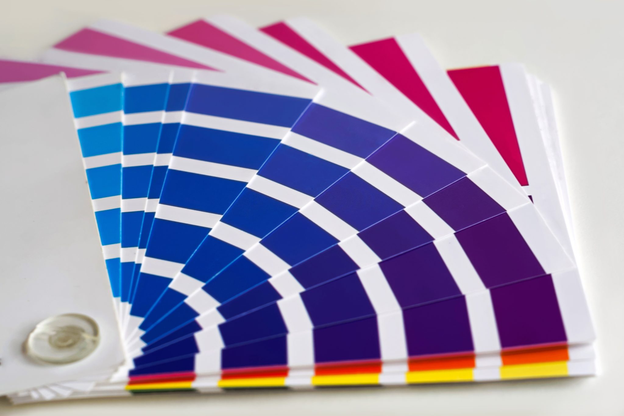
Implementing color theory concepts
Color theory is a concept that came alive in the second half of the 20th century. Designers understood that, albeit color perception is subjective, the impression of certain colors is universal. Using the subjective view as a basis, a color receives a connotation with a certain emotion.
[Check out our Designer Tips for Choosing the Right Color Palettes]
Here are some examples of color theory and how colors affect the customer.
- The color blue is by far the most popular solution for any business logo. Why? It has a soothing effect that radiates with confidence and security. Brands like HP and Intel market themselves as premium business solutions and the color blue contributes to that notion. Facebook, PayPal and other brands that work with money or personal information want to instill that sense of security.
- Black is the color of luxury and power. It’s also used as a connective color that strings all the other colors (if there are any) together. Nike, Adidas and other sportswear brands choose to be associated with this vigor.
- Red and yellow are colors of urgency. They are used to motivate the customer into making a purchase as soon as possible.
- Green is associated with nature, ecology and freshness. It instills positive emotions that are useful when assisting the customer during the customer journey.
Now that you understand logo design psychology and color theory, you know how to manipulate the emotional state of your customers. Start with a fresh idea or purchase a ready-made logo and go from there. Make sure that both the logo and the colors effectively represent your brand culture. Don’t forget to establish brand unison on all your social media channels.