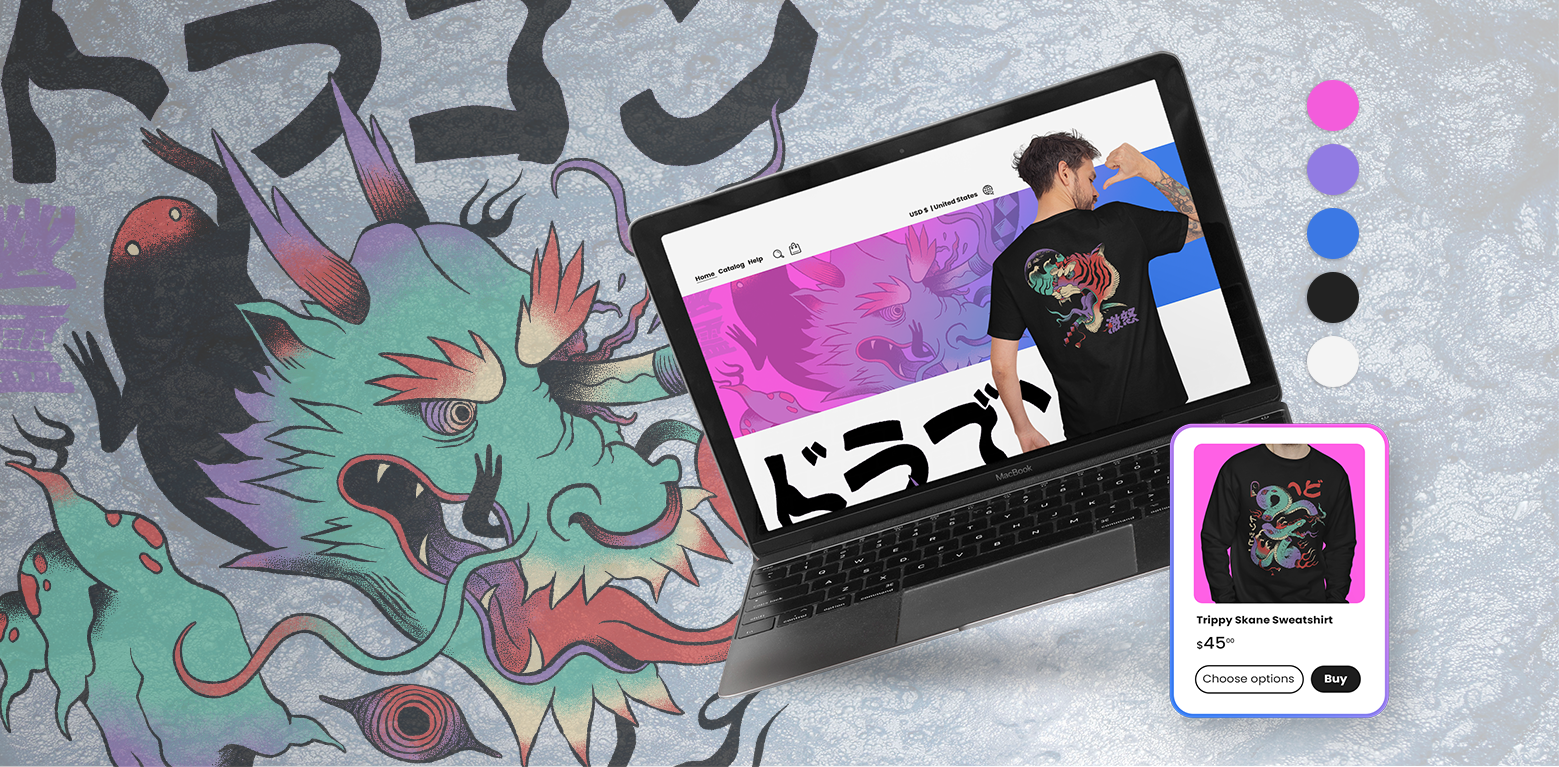
Color choice will make or break your brand. While the shape of things plays a crucial role as well, one should never underestimate the emotional impact of a proper palette. Every color arouses a particular set of psychological effects, so the right combination should fit the service or the product that lies behind the brand. In many ways, color is a rich realm of science that stands on its own, so, to make matters a bit more streamlined, here are designer tips for choosing the right color palettes.
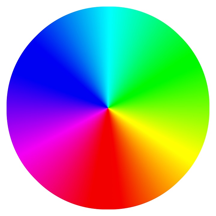
The wheel will be your best friend
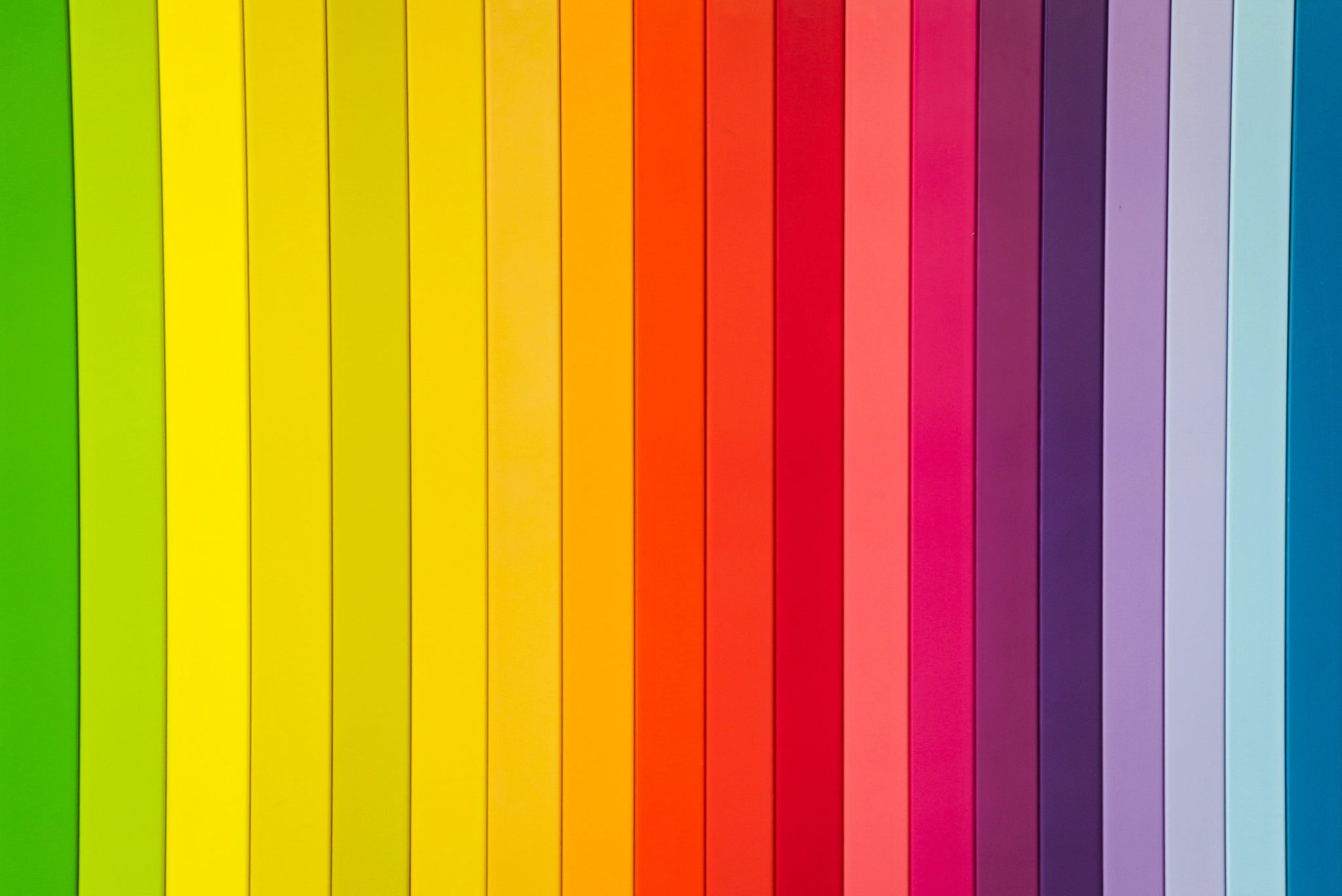
It is true that some people have an instinctive feel for bold color combinations, but even those that do not can learn things based on several quite simple matters. Primary, secondary and tertiary colors are usually assembled on a large wheel that renders the selection process a tad bit easier, but beyond 12 basic colors lies a whole world of tints, shades, and tones.
The key tip to know is the easiest one to grasp
In spite of that, the key to choosing the right color palettes lies in understanding the concepts of analogous and complementary colors. Analogous colors stand next to each other while complementary colors exist on opposite sides of the wheel. The combination and proximity of such pairings depend on the effect you want to achieve – complementary colors are easy on the eyes but they typically produce a dramatic and vivid effect, while combining analogous colors offers harmonious nuance and the expression of shadows.
Allow yourself to experiment
The most important thing is to experiment, and one of the safest ways to do this is to photograph the room and allow yourself trial and error in the digital realm. You can play around with light, shadow, and saturation in Photoshop, and mix things up a bit with preset Sleeklens Lightroom profiles for quick out-of-the-box palette arrangement. These programs are a time-saver and a beautiful consequence-free playground that has become a godsend for designers.
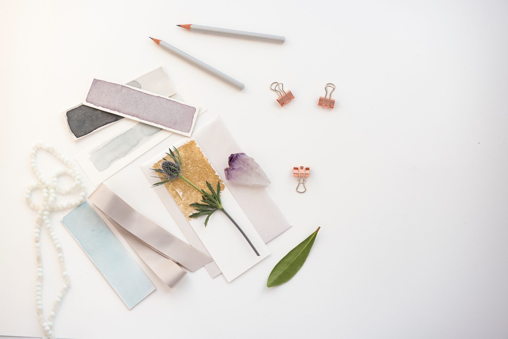
Use mood boards/swatches for a quicker process
However, you can streamline this experimentation as well if you group the colors into mood boards. As it has already been implied in the introduction, each color has a psychological effect, and each of the 12 main colors (each renowned for a specific set of effects) should be grouped with their appropriate analogous colors for mood boards and swatches that will aid you in streamlining the selection process.
Pay attention to the doubling effect
Be forewarned that colors can have a ‘doubling’ effect. For example, red can arouse excitement and love but it can also signify aggression. Blue associates us with calmness and sadness as well, green is the color of life and envy, yellow is about happiness and neurosis, and purple is about wisdom and madness in equal measure. The effect with color can go either way depending on the proximity of another color.
Use the baseline of three colors
If you want to keep matters simple no matter what you are designing – whether it’s a room or a brand logo – you can start off by using the baseline of three colors. This is a golden rule of design – you don’t want to make things to eclectic or wild before you see whether a broad design works with a few carefully chosen colors. A certain color needs to be the primary one, while the other two serve to enrich the design, bring out the ‘lines’ and ‘borders’ while eliciting a particular mood. The only thing that you have to be certain of is whether the combination of these three colors matches the mood of the topic or the product.
If in doubt, turn to nature
Designers are constantly looking for sparks of inspiration, both online and in the world that surrounds them. If you are not sure whether something works or not, you can always look out the window and seek out the natural assemblies of analogous and contrasting colors enriched with organic, natural textures. Interestingly enough, this texture is what can make a whole difference in the world. With the right stain and relief, the color combination that hardly worked before can suddenly pop with a wonderfully original flair.

Conclusion
An opulent flux of colors surrounds us during our every waking hour. In fact, one can safely state that humans cannot imagine life without color – it is as seamlessly integral to our lives as breathing. Slightly different nuances can provoke a staggering variety of emotions and even trigger memories. Because of this, colors represent more than a tool to designers – they are a weapon.
Color palettes can offer respite and they can disturb. They can cause pleasure or anxiety, calmness or aggression. The effect might be discreet – a form of background radiation, if you will – but it is inescapable and persistent. Color palettes move moods as continental plates move mountains – slowly and deliberately. So just imagine what a profound effect you can cause if you choose the right color palette for your room.