Logos are everywhere. They are the best way to brand products and organizations so that they are easily recognizable. Each logo design and style comes with its own allure that makes it stand out. This is very significant in ensuring the success of the logo and its acceptance within the target audience. One of the essential aspects of this logo appeal is the color palette. It’s easy to get excited and carried away during the design process and end up with a multitude of colors on the design which don’t necessarily serve your logo well. Let’s just quickly run through the proper design principles that can make it attractive without overdoing it.
Keep it Simple
This is probably the most critical principle to keep in mind during the design process. While this may sound obvious, logo design templates can be very tempting because they allow the user to customize the logo with any color of choice and in any manner that they wish. This can easily lead you astray hence you need to actively make an effort to keep it simple. Of course, colorful designs are OK when designing mascots which can be loosely categorized as logos but you will still need to keep the main logo simple to avoid an overdone color explosion.
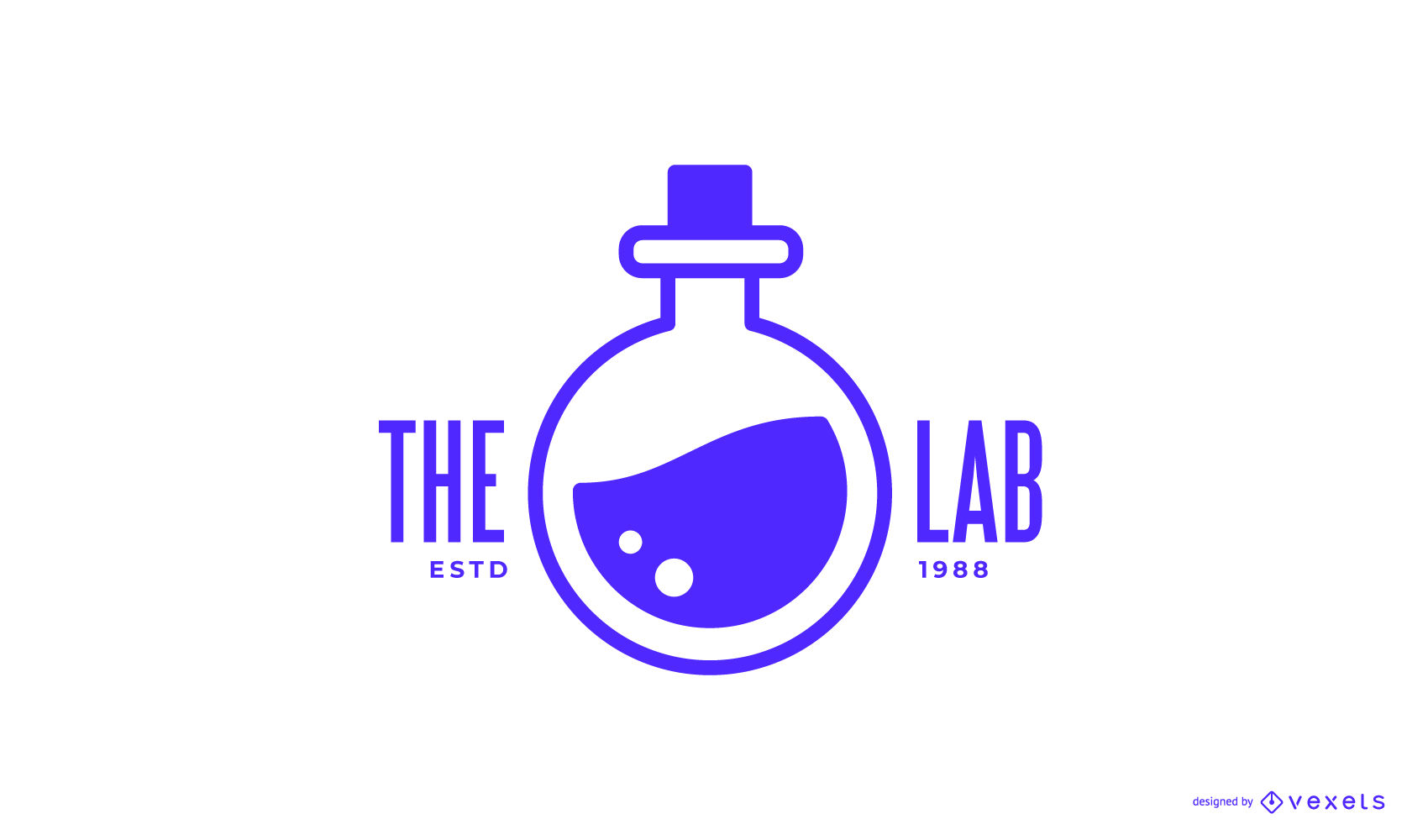
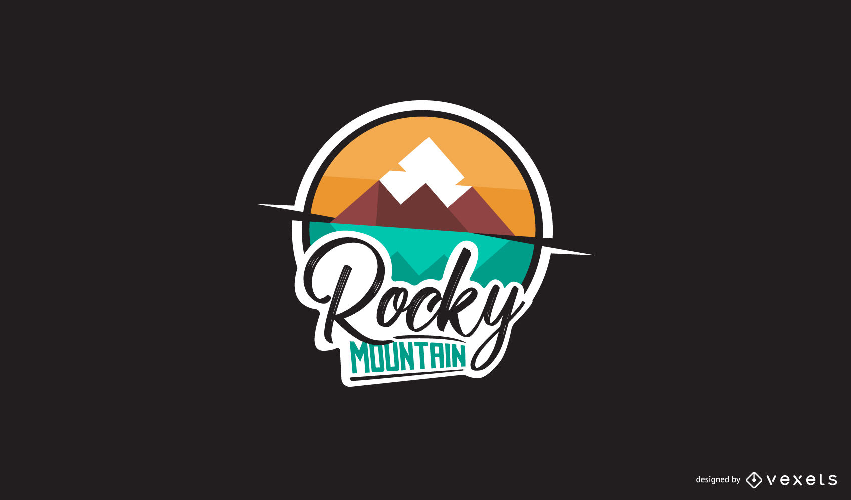
To keep it simple, simply minimize the number of colors used on the logo design. A logo should not contain more than 3 colors. The expertly designed logo design templates from design gurus like Vexels come with very convenient color palettes that are ideally rendered and contrasted to give the best visual appearance. While these are editable to suit your personal preferences, it’s always best to observe the recommended colors to avoid messing up your logo appearance. Both commercial use logo designs and personal ones can be derived from templates in any desired color tone. Let’s take a look at the kinds of color palettes so you know what to look for when choosing the logo color palette.
Warm Colors
Warm colors are distinctly attractive and can grab the attention of the audience quite easily. They possess a high Red value in design which gives the warm effect. They are therefore ideal for the new brands that are seeking to establish themselves on the market.
Cold Colors
This color category is predominantly blue and, as suggested by the name, it has a much less warm effect on anyone who views it. It is, however, more ideal for formal businesses that need a more serious aura for their clientele. While it doesn’t attract stark attention, it is more user-friendly and tends to be easier on the eyes than warmer colors. A perfect example of such a color application is Facebook, which has enjoyed wide success due to its comfort-inducing blue theme for its logo and app designs.
Monochromatic
This approach is ideal for brands that want to vary their logo designs from one campaign to another or in different periods because it allows creative changes without actually changing the logo color.
Analogue Colors
Analogue color designs for logos are very much similar to the monochromatic approach. They are, however, actually different colors that are closely related such that they can blend almost seamlessly without any stark variations. They are ideal for color-theme based logos that prefer to keep a general color tone for the logo or the whole business brand.
Complementary
This color design approach is aimed at giving the end product a distinct color variation to grab the attention of the audience. It is not very eye-friendly but it’s good at attracting attention. It features complementary colors on the extreme ends of warm and cold colors such as blue and yellow.
The meaning behind colors
The selection of colors for your logo design should never be random. These colors carry significant meaning as far as the feelings and the emotions that they provoke are concerned. It’s therefore critical to familiarize yourself with all these sentiments behind the colors before settling on any logo design color. Let’s just quickly explore these color meanings for a basic appreciation.
Let’s kick off with yellow. This is a ‘comfort’ color that triggers a comfortable disposition to those viewing it. As such, it is ideal for businesses that offer comfort and relaxation as part of their service packages such as resorts and hotels. Orange, on the other hand, is more attention oriented hence aims at garnering visual attention from an audience. This means that businesses such as food joints are ideally the best ones for such a color design since food joints or manufacturers need to grab the attention of shoppers and passer-by traffic to try their products.
Another common logo design color is red. It is pretty good at triggering strong passion and promoting general excitement. This explains why dating sites often use red for their logo designs. It can also be used to trigger excitement about a particular product whenever you see it such as the popular red Coca-Cola logo. In direct contrast, the color blue triggers calm feelings. As mentioned earlier, this color is used for businesses that aim at retaining clients for a longer period. Facebook, therefore, uses it to ensure that users can enjoy longer stays online while interacting with their peers with a calm and relaxed mood.
Green is also common with logo designs that are more sombre and serious. The color invokes feelings of success and growth which is generally synonymous with vegetation. It’s, therefore, no surprise that green is used by agricultural brands and money-oriented business such as banks and investment firms. Lastly, let’s take a look at the age-old black and white color combination. When used in logo designs, this color symbolizes sophistication and class. It is common with high-end brands and logos such as Playboy, Adidas and Louis Vuitton.
With such a deeper understanding of colors and their implied messages, the ideal color for your logo design shouldn’t be a problem at all. Just ensure that your selected colors match the vibe that you’re aiming for to be associated with your brand.
When creating a store in marketplaces like Redbubble, for example, a great way to determine the suitability of your logo is to compare them with other logo designs that are already on the market with successful performance.
Creating all these colors can however be nearly impossible from scratch. Rather, logo design templates are the better option since they take into cognizance all these color principles to ensure that your logo design is not haphazard or an annoying eyesore.

