When first starting out in the world of eCommerce, designing your homepage page can seem like a rather daunting task. Unless you are well versed in the intricacies of web design, looking at that blank page and deciding what to put on it, and where, can leave you scratching your head in frustration as you second-guess every choice you make.
Luckily, there are some tried and tested methods of homepage design that will garner the results you want, with very little effort involved to implement. While most eCommerce platforms make things as easy as possible for the user, it still never hurts to look at some techniques that other companies have employed, and use the same strategy to improve your own site.
When it comes to your company logo, it obviously needs to be easily visible as soon as your homepage has loaded.
Need to design a company logo? Use our Editable Logo Templates or our Online Logo Maker here!
Often companies will put it in the top left of their navigation bar, and make it clickable as a quick link back to the homepage. This will mean that no matter how deep a customer ventures into your site, they are never more than a single click away from being back at the start of their shopping journey.
Image source: salehoo.com
Along with a strong logo, your store’s front page would also do well to have other logos and badges, such as “trusted by” (if you happen to be a B2B), or “average rating of XX” if you can point to stellar reviews from your existing customers. Anything that builds trust in your brand is a good thing, so show these aspects of your company off the moment a customer walks in the digital door.
Intuitive navigation
The navigation bar itself is your road map within your eCommerce site. It should be viewable on every single page you have, and it should provide shortcuts to areas of the site that customers will find useful.
From the homepage itself, you should provide access to all major departments within your product range, with dropdown menus for areas that comprise of multiple facets. For example, a clothing store could have a ladies section which drops down into different styles.
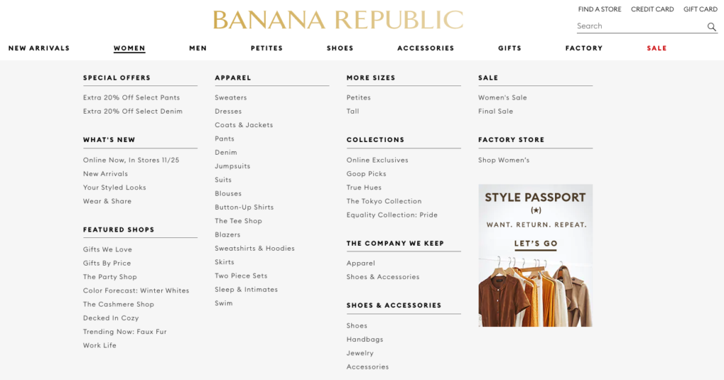
Image source: bananarepublic.gap.com
Without a good navigation bar, customers can become frustrated when trying to find certain items, or even just generally browsing your store. If you want to turn those casual browsers into customers, you are going to need to make it as easy as possible to find whatever product they may find appealing.
Images, photos, and sliders
When it comes to photos and images shown on your homepage, it really does depend on your product and what sort of image that you wish to instil in the minds of those who visit your site. We always recommend using Template Designs, like Banner Templates, for all Homepage eCommerce sites. Many modern, smart looking sites often go for images of their products in action (think clothing stores that show a model in a real-life situation wearing their brand), with photo sliders showing off a variety of professional photographs or graphics.
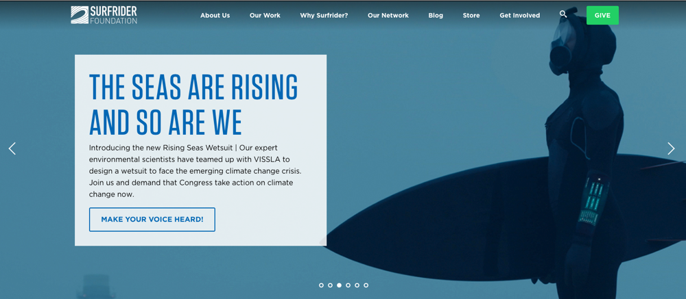
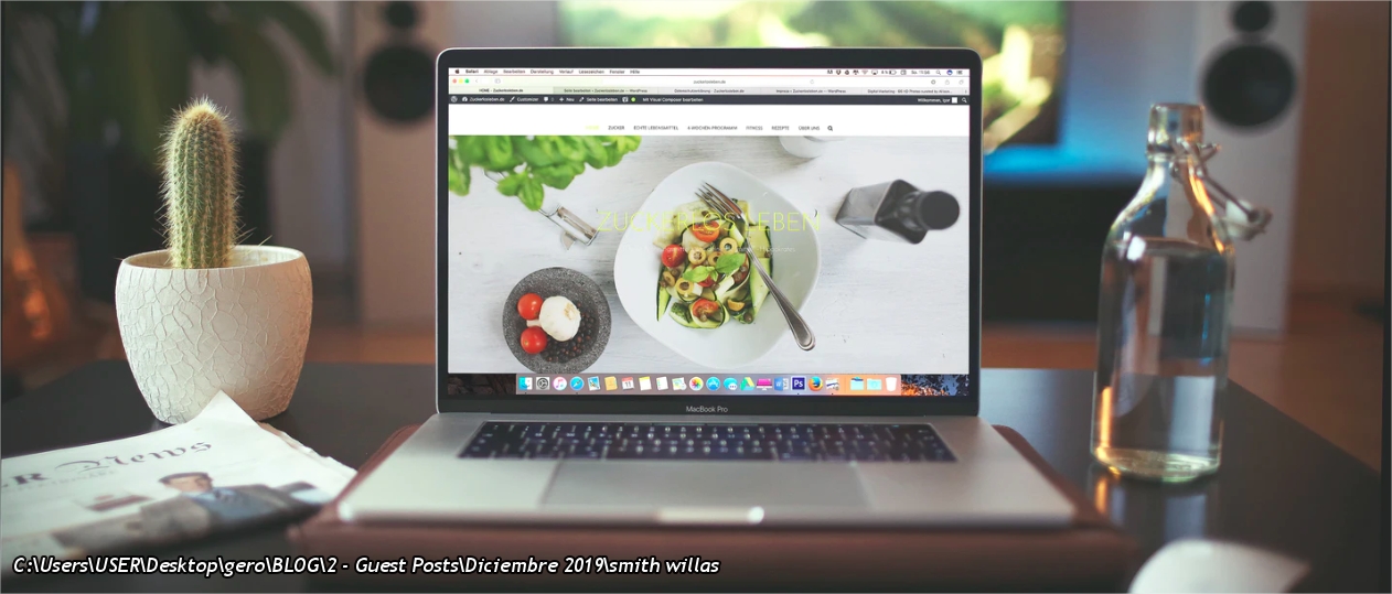
Image source: surfrider.org
This approach often looks far better than having a landing page populated with rows of products (they will be in your sections accessible from the dropdown menu), and allows you to give the consumer an image of your brand that can differentiate you from the more cluttered looking sites out there. It is also extremely easy to update these images, allowing for seasonal changes to be made at the click of a few buttons. This keeps your website looking fresh and active, while also having the wonderful side effect of improving your SEO, because active websites are listed higher in Google rankings.
Sure, Amazon may not use this approach (their homepage generally delves straight into the products), but they happen to be the biggest eCommerce site on the market. You, on the other hand, need to make a strong first impression. Check out some of the brands that you personally like, and see what their approach to landing page images are like. The chances are, the best of these brands will have a clean looking landing page with photo sliders showing off the products which they sell. These images can still be clickable, taking a prospective buyer straight to the shown product, but they generally shy away from being a standard mundane sales box.
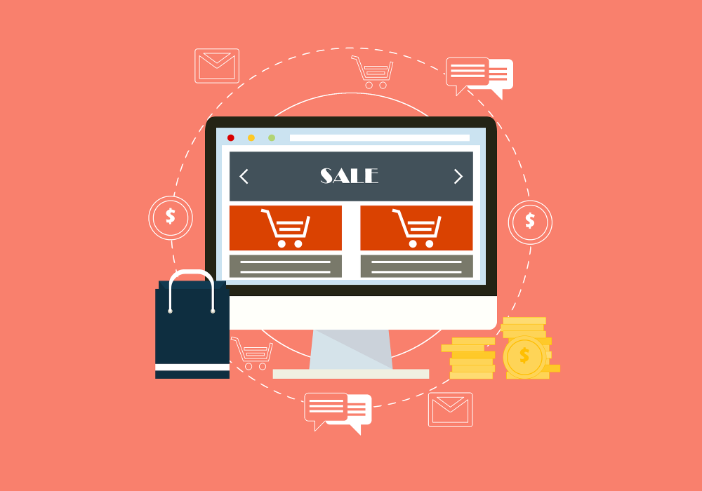
A strong primary CTA
CTAs (calls to action) are clickable links within your homepage that do exactly what their label suggests. An example for an eCommerce store would be something like “sign up for our free newsletter.” Adding a CTA can be a great idea to engage with potential and existing customers, as you can often turn visitors into leads using this technique.
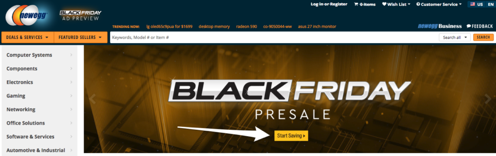
Image source: newegg.com
The language you use within your CTA is also extremely important, where using the wrong word can be quite off-putting for potential customers, whereas others can draw intrigue. While there is nothing wrong with a simple “shop now,” often, something along the lines of “find out more” will draw interest from customers, as it sounds less about making sales, and more about getting information.
Small psychological tricks such as using the right language can make all the difference when using CTA’s.
Experiment with the elements
Once you have your store-front up and running, it is often a case of simply tweaking it here and there as the seasons and products change. Choosing the right platform is probably the most important part of your decision making at this point, because once you have found a shopping cart solution that suits your needs, you should find that the changes you do need to make from time to time are minimal and easy to implement.
Build the foundations well, and see just how easy it is to maintain the house thereafter.