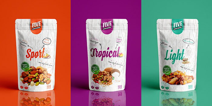
While walking through a store, customers only get to see your product packaging design. That’s it. According to recent research, shoppers make their purchasing decision within eight seconds; that’s the chance you get to catch their eye. Color plays a major part at this moment since it communicates value to consumers and conveys a message.
Check out our Ultimate Guide to Design Templates to get started on designing your new brand and packaging!
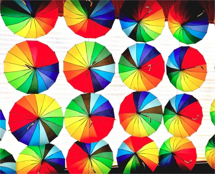
The Meaning Behind Every Color
Before exploring the possible color schemes for branding, as well as your packaging options, read this quick guide on the meanings behind each color:
- White. Though it looks great, it’s not recommended that you create a white logo but it is recommended that you have white/black versions of any color you choose.
- Black. Dramatic and sophisticated. Black is perfect for serious and luxurious brands.
- Gray. Sleek and timeless, this is a great choice for tech and contemporary brands that start trends.
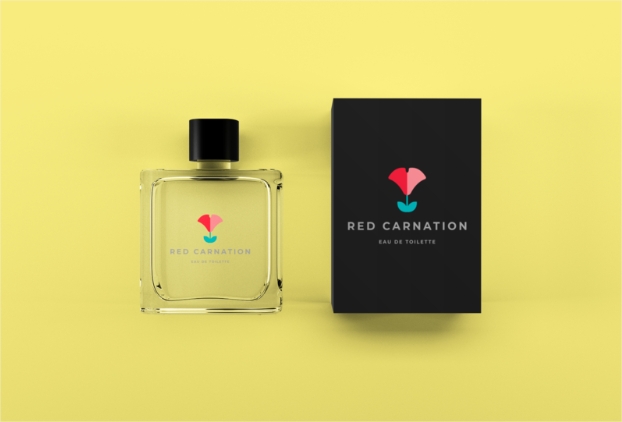
- Red. This is the most expressive color that embodies passion or romance, but also anger and danger. It works great for restaurants, food logos, and vintage-looking brands.
- Orange. As energetic and youthful as it is, orange should be used by active brands for young people.
- Yellow. The brightness of yellow portrays optimism. It’s a perfect go-to color for those brands who are innovative and avant-garde.
- Green. Nature is, of course, the first thing we associate green with. It’s a rejuvenating color that delivers a message of credibility and honesty.
- Blue. This is a safe one. Blue hues reflect security, so they’re perfect for sending a trustworthy message. Right now, I can think of at least four bank logos that are blue.
- Purple. The most regal of colors. Purple is ideal for elegant, mysterious, and enchanting brands.
- Pink. There’s nothing boring about pink. This is, in fact, the most festive color that automatically brings a fun message.
How to Choose the Right Materials
Now, the first step to get an attractive packaging design is to choose materials that fit your product. Here are some of the pros and cons of each one:
- Cardboard. This is one of the top materials for packaging because of its durability and protecting qualities. It’s also a great choice for the environment because it can be recycled easily.
- Paper bag. A great choice to display something that doesn’t need that much protection from external moisture.
- Plastic bag. Though I encourage all brands to avoid plastic, sometimes it’s absolutely necessary when you don’t want the product to be compromised by weather, dirt and environmental factors, mostly when it comes to edible products.
- Glass. This is a great choice for its recycling qualities. It’s also the healthiest option to keep liquids and jelly because it doesn’t need any harmful chemicals during its manufacturing process.
- Aluminum. It offers a great barrier to protect liquids from light, oxygen, and microorganisms. It also allows you to store products without the need for refrigeration, so they last longer and can be carried long distances.
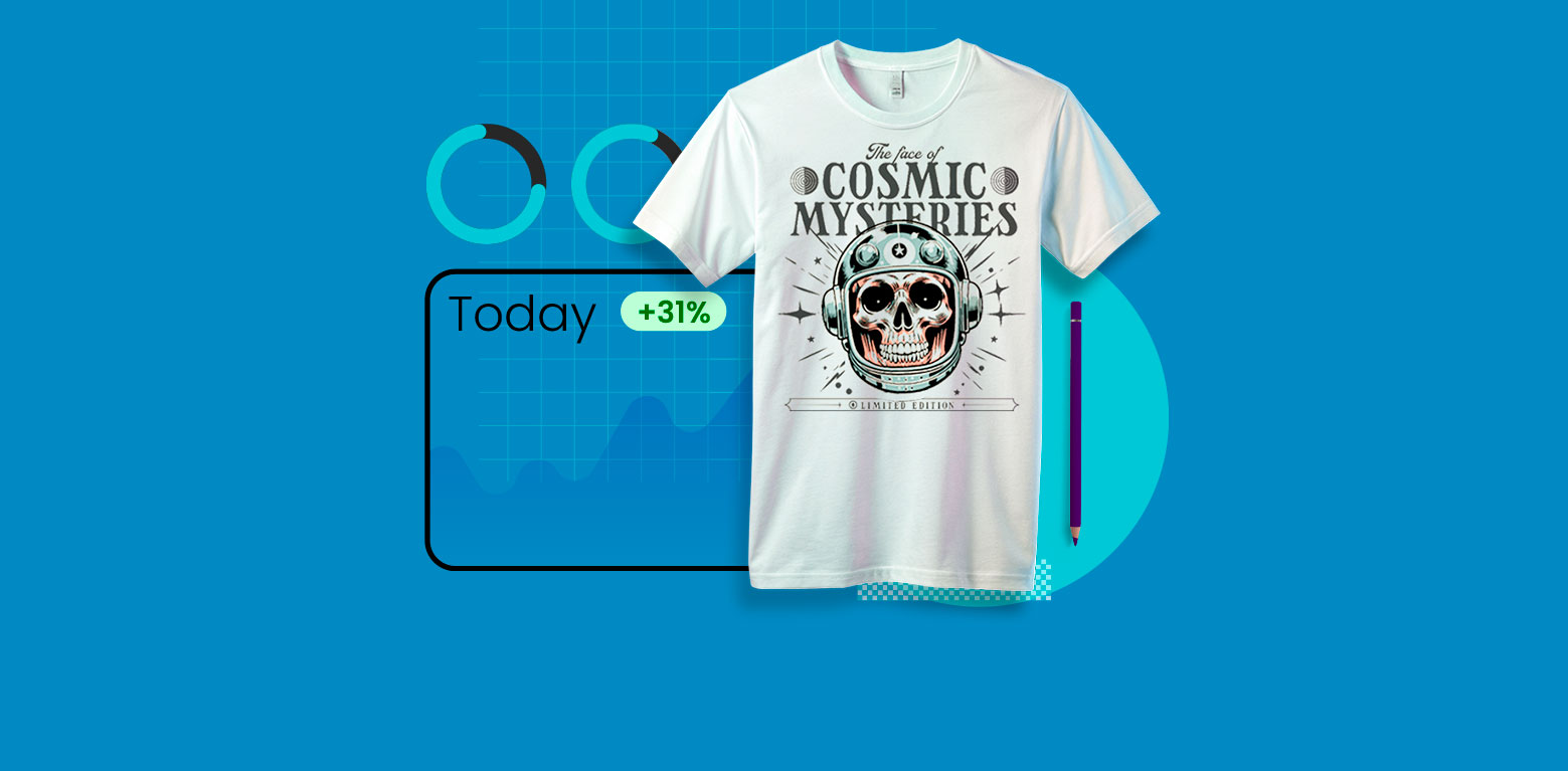
Save money and time by using a packaging mockup to see how your product would look. You can choose from a wide variety of mockups, so you won’t be limited. Once you choose the right material, benefit from online tools like a Mockup Generator to create mockups without spending on photoshoots and editing.
Work on Your Branding Strategy
Besides getting great packaging to display your product, you should start working on your branding strategy and setting goals for when you’re ready to sell.
Create a Logo
First, create a beautiful logo. You don’t need to be a skilled designer, by simply using a logo generator you can save time and create a professional-looking logo in just a few minutes.
Pick the Right Colors
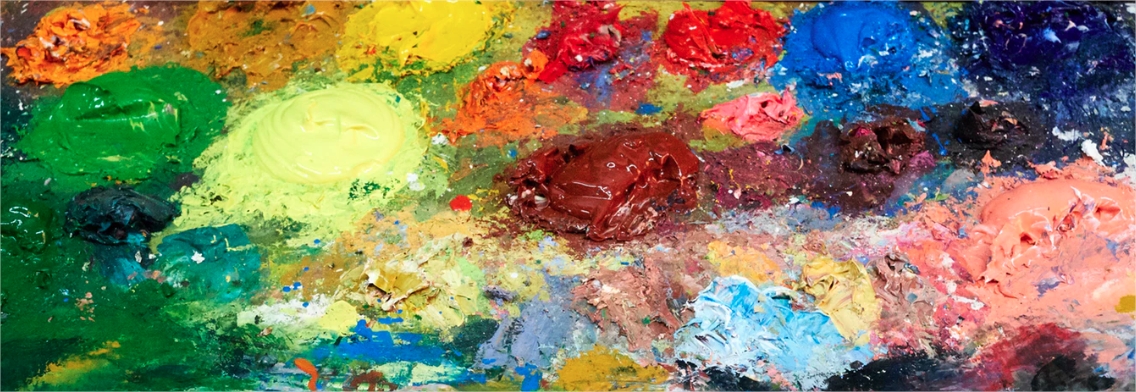
Make sure you choose the right colors to match your brand’s message since you don’t want to send mixed signals. Also, stick to a simple design; remember that complexity in graphic design is outdated and doesn’t work well for new products or services.
When choosing a color palette for your logo and packaging, go for complementary colors and create two or three logo color schemes to choose from later. Each scheme should be based on three colors:
- Base color. This is the dominant one, it will identify your brand.
- Accent color. The second most used after the base. If you’re struggling in choosing this one, go for the complementary of your base color.
- Neutral color. This works as a background color to make your logo stand out.
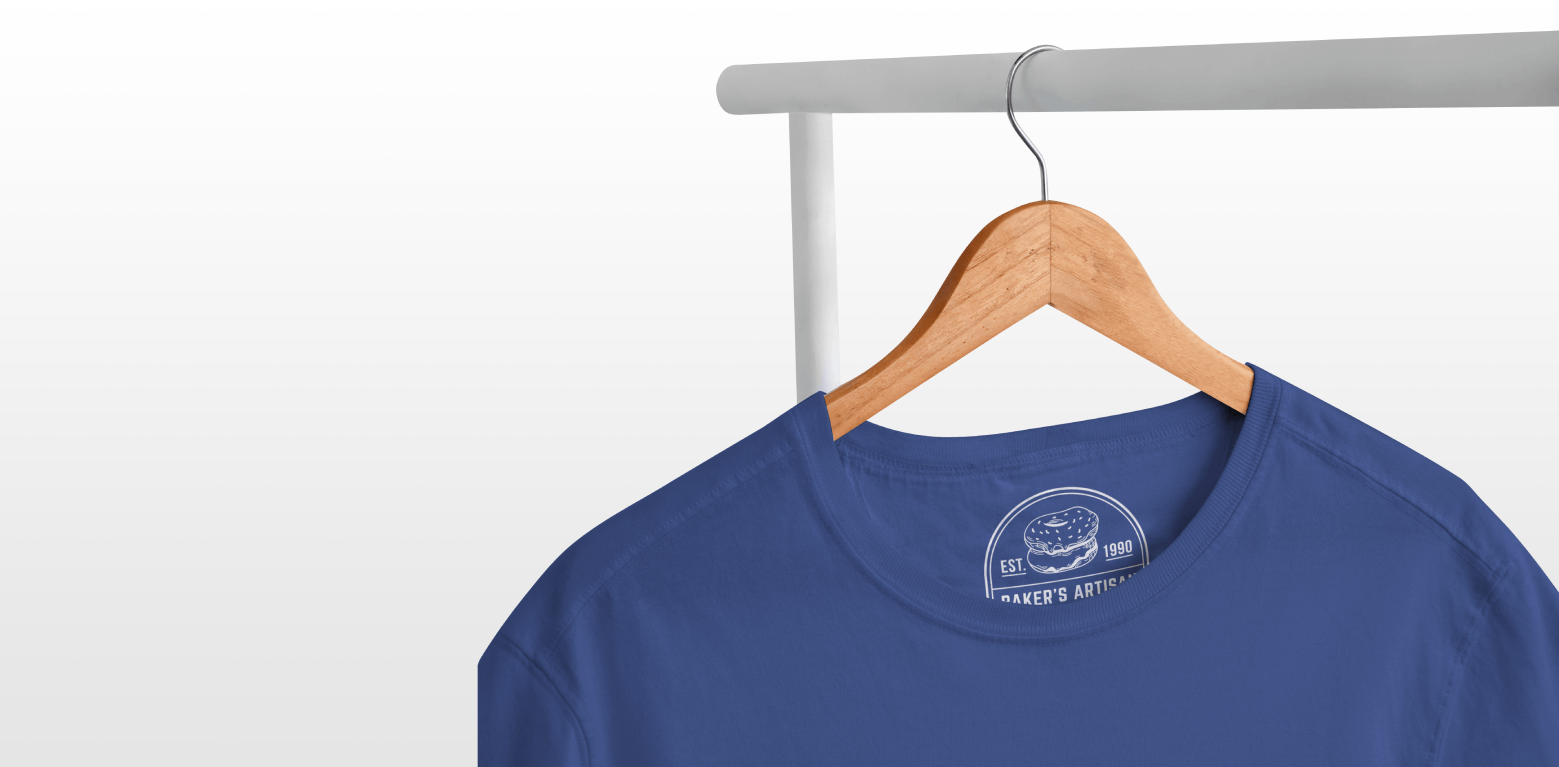
If you’re into getting brand identity clothing for your team, you can also create t-shirt designs for your business and use a t-shirt mockup generator to see how your logo would look on clothing.
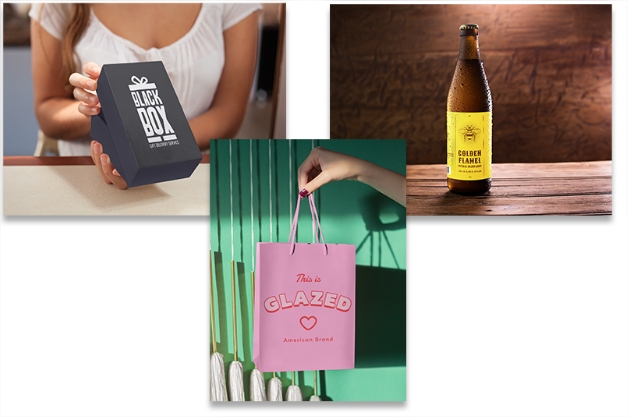
Famous Brands with Famous Packaging
Choosing a color scheme is just one piece of the puzzle. You should also think about creating something that’s really unique for your brand and that makes it stand out among thousands of brands.
Think about it. Why do people perfectly remember how Tiffany boxes look? The company has recognized the power of its signature color, Blue 1837 in the Pantone Matching System. Why is a single color so relevant for a brand? This is all thanks to years of well-done branding and an exquisitely curated brand persona.
Another example can be McDonald’s famous branding. Try not to think about how McDonald’s smells when looking at its golden arches printed over a red cardboard container. This effect is proof that color conditions the way we think, and encourages the urge to buy or, in this case, to eat some deep-fried fast food.
Color Palette for Print and Digital
Colors don’t look the same when printed on different materials. Make sure you test them out enough to get great hues that can be adapted to digital media and print material.
- Choose an adequate palette in RGB colors for digital media. Test it on different screens as well as mobile devices to make sure it looks right.
- Choose a palette in CMYK for printed material. The conversion from RGB to CMYK can be done in most editing software, just make sure it looks well after printing.
The Reactions of the Brain While Shopping
As stated above, every design –especially because of its color– has a different impact on the human brain. But what does our brain think when we look at these colors? Each one stimulates its own visceral connotations; the ones that get the most attention are black, yellow, and red.
Red raises the human pulse when we see it, that’s why it’s known to attract attention and trigger appetite. Yellow stimulates mental processes, while green makes the human brain increase productivity, and blue creates a sense of trust. This makes it the favorite color of most people.
Can you think about another way color has influenced how people interact with your brand?
Hopefully, this guide will be useful to make the best choices for your product packaging design, so you can boost your sales. Share your design tips, or what colors have worked best for your industry.