Here’s the thing.
Your landing page doesn’t have to scream “Buy Now” or “Subscribe” for your website visitors to act on your conversion goals.
It’s how you create your landing page design that can help turn your website visitors into buyers and subscribers.
Used the right way, web design elements like colors and a compelling copy can be powerful factors that can help you attract new customers, generate more traffic, and increase your conversion rate and sales.
After all, when you establish a design that works perfectly for your business, you’ll avoid making the common landing page design mistakes and seriously hurt your conversions.
If you want to know how the pros do it, here are five landing page design tips that can shoot up your conversions.
Let’s hop to it.
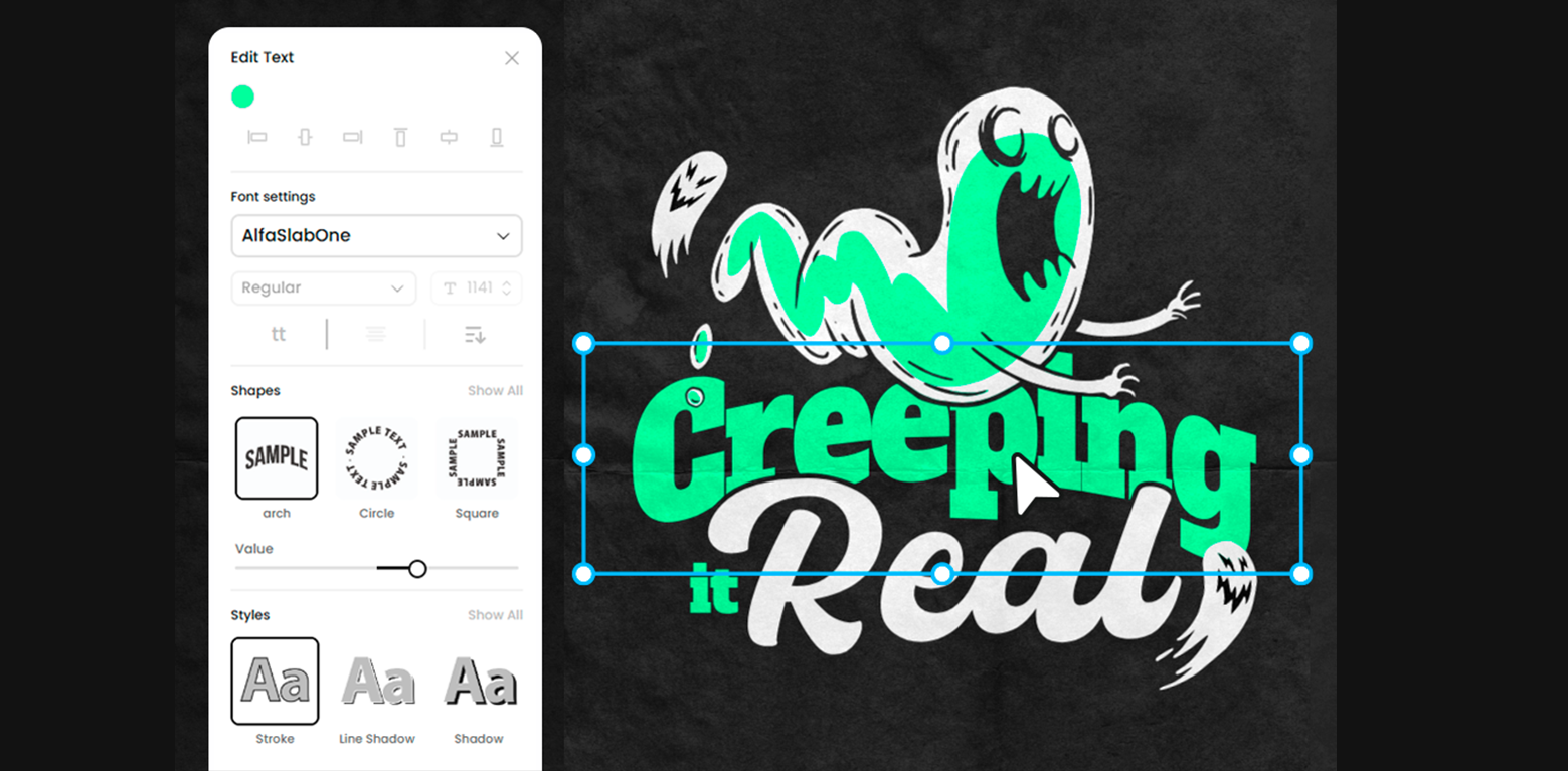
1. Use colors to your advantage
When your target users get to your landing page, it can mean that they’re a few clicks away from acting on your conversion goals.
You don’t want to see that opportunity fly out the window by failing to take advantage of the power of contrast and colors to help convert your website visitors.
Give your site visitors a nudge towards your CTA buttons by applying a color scheme that isn’t distracting or affects the readability of your landing page texts.
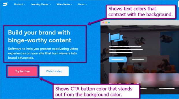
Image Source: Wistia
By using contrasting colors that can visually appeal to your site visitors, you can bring their attention to your copy and CTA buttons.
You can also apply color psychology to appeal to your target market’s perceptions and emotions – such as green for relaxing, black for luxury products, etc. for your other page design elements like your logo.If creating the best color combination for your logo isn’t your strongest suit, you can work with an online logo maker like LogoMyWay to create professional-looking logos that embody your brand.
Using contrasting and visually pleasing colors can help draw in your target audience and highlight the page elements you want them to focus on or take action on.
2. Establish a structure
If you think your landing page doesn’t need a carefully-thought-of structure, then think again.
Placing your web design elements in a specific sequence will help direct your website visitors deeper into your landing page and, eventually, towards acting on your offer.
For instance, you can use elements like arrows and other directional cues to draw the attention of your potential customers to where you want them to go.
H.Bloom uses directional cues by showing a numbered sequence of how their service works — showing website visitors a brief rundown of the process.
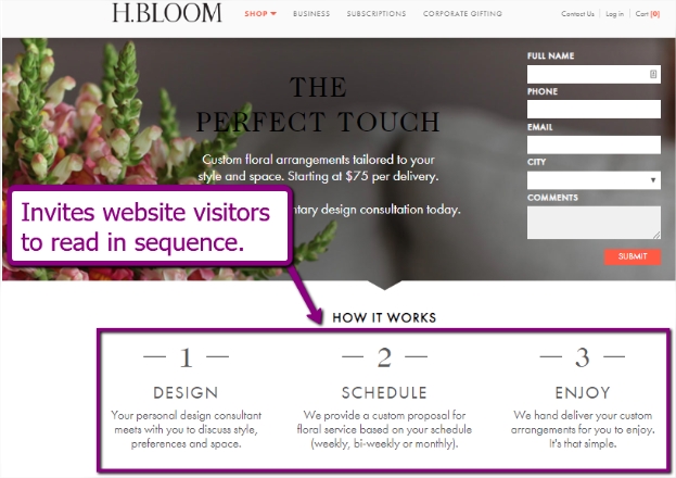
Image Source: H.Bloom
With this kind of structure, you can present your offer and show your site visitors how they can acquire your services – while addressing their potential pain points and providing the benefits your business can give.
Here’s a sample sequence you can consider when laying out your landing page structure.
- Your catchy headline.
- An engaging or relevant image.
- Your contact form.
- The features and benefits of your services or products.
- Your reviews, case studies, and social proof for your products, services, or business as a whole.
If appropriately designed, your landing page structure can help guide your website visitors through your page where the end of their journey ends with taking action on your conversion goals.
3. Create attention-grabbing headlines and subheadlines
If you want to make your visitors stay long enough to see your offer and convert, then creating attention-grabbing headlines and subheadlines on your landing page is one of the best ways to do it.
Your headline and subheadline should provide details about what your products or services are all about. You should also give your site visitors a compelling reason to keep scrolling through your page.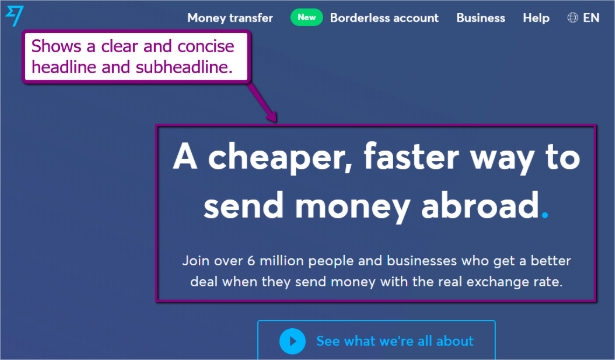
Image Source: TransferWise
For instance, if you offer life coaching certification, then you can use a headline like “Become a certified life coach today with our beginner to advanced programs.”
When creating your landing page headline and subheadline, keep these factors in mind.
- Place your subheadline directly below your headline. Your subheadline aims to provide more details about your headline, so it makes sense to keep them together for better readability for your site visitors.
- Keep your headlines short and clear. Although it’s not an absolute web design rule, keeping your headline within 20 words helps you be more direct to your target audience with your offer.
- Target the emotions and the identifying traits of your visitors. This helps make your message relatable to your target audience and what you have to offer something that can address their pain points.
Remember, your headlines and subheadlines are some of the first things your website visitors will see on your landing page, so you need to pique their interest right off the bat.
If you can do that, you’ll have greater chances of converting your site visitors into buyers or subscribers.
4. Use landing page creation tools
There can be a lot that goes into designing a high-converting landing page, but you can make the process easier by using the right tools.
With solutions like Instapage, designing your landing pages is easier and faster.
You can create responsive and personalized landing pages using the tool’s freeform drag-and-drop interface.
You can choose from the tool’s library of pre-designed landing page templates, or you can start from scratch and create your own designs.
Aside from letting you create custom landing pages, Instapage also offers simple A/B testing tools with analytics functions to help you determine which designs work best for your business and drive more conversions.
By using the right tools, the process of designing a landing page will no longer be a time-consuming and energy-draining task.
With a landing page solution, you can create your landing pages with more efficiency and ease, plus, ensure that your design is geared towards increasing your sales and conversions.
5. Improve your page aesthetics with high-quality images
Images continue to be excellent visual aids for your web content — such as your landing page — because they can reinforce the message you want to convey or serve as eye-catching elements.
Plus, using appropriate images helps your visitors visualize your products, services, or what they’re signing up for.
The key is to ensure that your landing page has the right images – ones that can help compel your site visitors to convert.
Here are a few tips for doing just that.
- Ensure your pictures and visual elements are relevant to your offer; otherwise, they could end up being an eyesore or confusing to your potential customers.
Take a look at the background image of Trulia – a home and neighborhood site for buyers and renters. It is very much relevant to the services they offer.
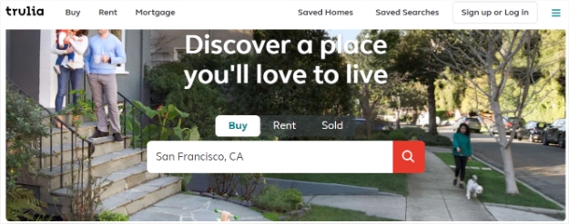
Image Source: Trulia
- Your images should be big enough so your site visitors can see your products or visualize your services without needing to zoom in.
- Make sure your images are clear – not blurry, pixelated, and too dark or bright (among other things).
Using high-quality images might be a bit of an investment, but they’ll be worth the costs since they’re visual elements on your landing page that your visitors can relate with.
This helps you build trust between you and your potential customers, establish customer loyalty, and increase your conversions.
Are you ready to design a high-converting landing page?
There might not be a PERFECT web page design, but considering these five tips can help improve your landing pages to raise your conversion rates.
Did you learn something from this guide? Let us know!