Guest post by Freddie Tubbs
Landing page design builders are more and more common these days, and although this is a great tool to use, it’s risky to assume no additional design work should go into the page. Whether the landing page is templates based or your own creation, you still need to make design decisions to optimize your landing pages. There are a few common mistakes that are seen regularly; this article will help point these out so you can make sure you’re avoiding them.
Cluttered Pages
Putting too much information in one spot is also a common mistake that’s easy to avoid. White space is underrated and quite important in calming a user and minimizing the risk of overwhelming them. White space can actually be helpful in getting users to complete a form, as the directions are quite clear.
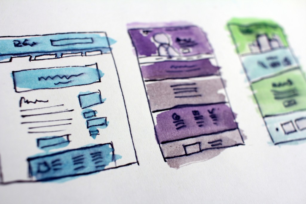
Cluttered layouts are common mistakes that first-time website designers might make as they try to be different and stand out. Instead, keep it simple with only the most important information on your landing page. Terry Hughes, a ux design professional at Boomessays and Revieweal states that “there’s no one-size-fits-all approach for layouts but single-column layouts have been found to be very effective in keeping users focused, and also in helping optimize your page for mobile usage.”
Call-to-Action Not Obvious
A call-to-action (CTA) is an item on your website that prompts someone to take action. This can be text or an image, such as an eBook download, a purchase, or signing up to something. The CTA is key in getting your customers to your desired outcome. If a CTA is unclear, you won’t get the download or the purchase. Instead, the users will leave the site, which can affect your rank for Google searches. Furthermore, if you have too many CTAs, it can confuse a user and make them just as likely to leave. Landing pages should have a single focus to keep things simple for the consumer.
Another common mistake with CTAs is that they can be missable if the design is distracting, or they’re not located in a spot that stands out. Having good CTAs to inspire your customers is vital for every landing page. Helpful tools you can use to create content with a successful CTA are Oxessays and Study demic.
Failure to Optimize Sign-up Forms
The form placement on a landing page is absolutely an essential factor in conversion rates. Forms that are not easy to locate have lower delivery results. Everything on the landing page should be designed to draw the eye first and foremost to the sign-up form. Additionally, it should be located near the top of the page instead of being buried later down. It’s possible to get form optimization tools which provide reports on different form fields and which ones are more problematic for users, as well as options to improve the design of the form.
Not Knowing Your Audience
To get a successful landing page design, it’s a good idea to start by defining your target audience and creating the design that is focused on their particular needs. Many pages are unfortunately not geared towards their audience, the customer. They are focused on the business’ message and not the user experience. That’s why you should start by understanding your audience and what they are looking for.
Lack of Landing Pages
An extremely common mistake in design is not creating enough landing pages. Every service or product should have its own landing page. As mentioned previously, if there are not enough landing pages it can lead to cluttering since you’re putting everything on one landing page, and your messaging will be vague. Having multiple pages allows you the flexibility to target each one to the right audience.
Poor Design Elements
A landing page should be in line with the rest of the brand in terms of design, and when it is inconsistent it can have a negative effect. Phoebe Rogers, who is a design blogger at Stateofwriting and Resumention says that “if a landing page or mobile representation looks noticeably different from the main business’ website, users may be unsure about the veracity and legitimacy of the content which leads them to look somewhere else.”
Here are some good examples of design elements that can bring a lot of value to your landing page:
Source: https://www.vexels.com/vectors/preview/147456/business-roi-icon-set
Source: https://www.vexels.com/vectors/preview/152241/thin-line-marketing-icon-set
Source: https://www.vexels.com/vectors/preview/152930/business-icons-vector-graphic-set
Ignoring A/B Testing
Another common mistake is the failure to run A/B testing or testing for the wrong things. It’s important to measure how well a landing page does in terms of click-through rates, bounce and conversion rates and how your page design plays into it. However, don’t think you need to test every single detail on the landing page but rather the ones who would have an impact on purchasing decisions.
By avoiding these common mistakes, you’re well on your way to optimizing your landing pages for the most successful consumer experience!
About the author: Freddie Tubbs is a design blogger at Ukwritings. He regularly takes part in online tech and design events, and contributes posts to Australian Reviewer and Essayrooblogs.