Guest post by Lexie Lu
Back in 1999, Amazon was a small online book retailer. Today, it’s the fourth-largest company in the world and serves billions of people globally. To get an idea of just how large Amazon is, consider its Seattle headquarters employs about 7.5 percent of city residents, or approximately 40,000 people. That must drive a lot of coffee sales.
In 2017, Amazon’s net sales were $178 billion, with an estimated brand value of $207.59 billion in 2018. The company averages 27 percent annual revenue growth. Studying Amazon’s success and paying attention to the subtler points of its website made me a better designer.
In nearly every industry, there’s a movement toward digitization. Even traditional brick-and-mortar establishments see the need for an online presence. Keeping up with advances in tech isn’t easy, so I spent time studying Amazon and figuring out the design behind its success. Here are the lessons I learned from Amazon.
Adequate White Space
One thing I noticed while studying Amazon is that while there is a lot going on with deals, suggested similar products and navigation, there is also plenty of open space surrounding each element. It benefits users by giving their eyes a break from all the content and creating a more skimmable page.
In the early days of web design, people often crammed a ton of text onto a page without much of a break for the person reading it. Modern web design, however, allows for negative space — not necessarily white — and offers a cleaner, more streamlined design. Users navigate a site with a balance between positive and negative space more easily, because elements are easier to locate. Create a balance between positive and negative space on your landing pages, even if it means moving some elements to another location.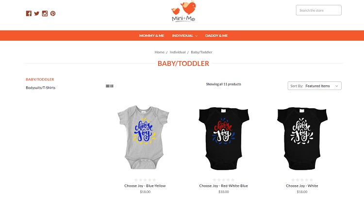 Note how Mini+Me takes a page out of Amazon’s book and adds plenty of white space around elements on its pages. Each item is easy to view at a glance because it is set off by itself. This model worked well with Amazon, allowing people to scan a page filled with products quickly, so it’s the perfect model for an online clothing store.
Large Hero Images
You’ve probably noticed the recent trend of using large, vivid images that reside both above and below the fold. Amazon does this very effectively, and I learned a lot by looking at how it incorporates hero images into the overall design. On Amazon, the image fades out as it goes down the page. While there are still elements of the image in the background, creating that same sense of symmetry, the lower image is of little importance and doesn’t distract from the content on the page. In this example, the most essential element of the hero image — the camera — appears at the top of the page just under the navigation.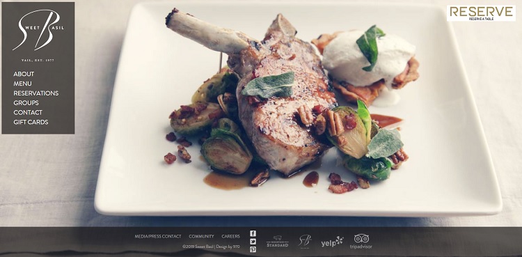 Sweet Basil takes the idea of a big hero image and utilizes it to show off some of the dishes and the atmosphere of its restaurant. Note how it uses an overlay for the navigation menu, so you can still easily see the various areas of the site, such as where to make reservations or purchase gift cards. The image fills the entire background and is the main focus when you first land on the page. This particular site also uses more than one hero image, rotating among different photos.
Simple Layout
Amazon uses a straightforward layout with a header that stays the same on each page and sidebars and a footer that adapts to the page you’re on. No matter where the user goes on the site, they know where to find the homepage or major categories, because the overall layout always stays consistent.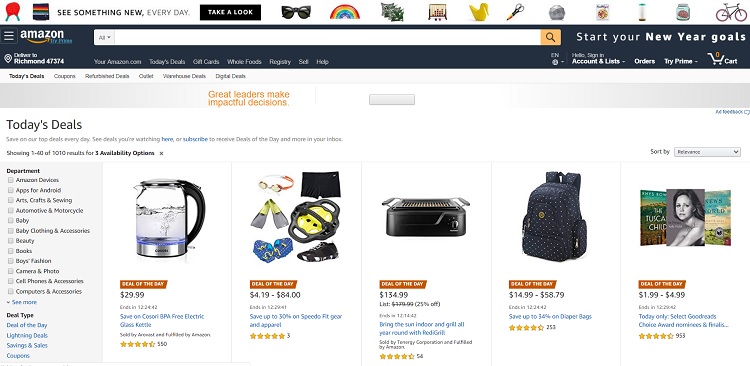 The design is familiar to most users because they are used to the structure of a header and footer, a wide middle column for content and sidebars on either side. Many sites use this structure, so users barely have to think about where to find information.
Using a ready-made layout saves you time and effort designing and coding a site from scratch. You can still customize the look of your site and make it unique. For an e-commerce site, stick with a look users expect, such as thumbnail images on the homepage and then larger images for description pages.
Limited Color Palette
Amazon’s color palette is neutral and limited. On its landing page, you’ll notice white, black, grays and a pop of bright yellow for calls to action (CTAs). Using the same colors throughout the site allows a sense of symmetry. Consumers see your site as more reliable and recognizable, which allows a level of trust that makes them feel more comfortable giving you their personal information. Using the same colors not only creates a cohesive design, but also a strong brand presence.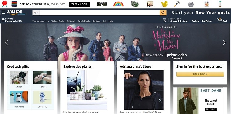 Look at the landing page for Sincerely Nuts in the screenshot above. Note the limited color palette that ties into its brand colors. It uses white, black and a bright pistachio green. CTAs appear in red, which contrasts nicely with the rest of the colors and makes them pop.
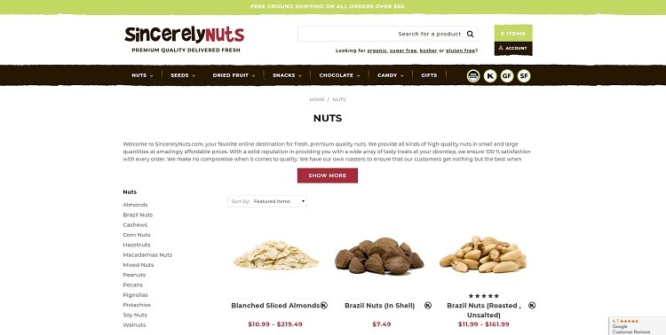
Mobile Friendliness
Amazon is easy to view both on a regular PC and mobile devices. People are increasingly using its smartphones for internet browsing. About 75 percent of consumers own smartphones, and half of them use the devices to shop.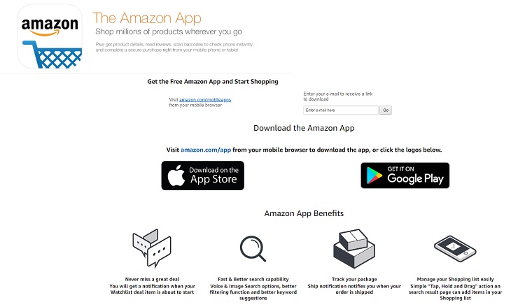 Amazon offers an app to help mobile users better access its site, but even using the site via a mobile browser such as Safari presents an easy-to-navigate view.
Even a business not yet able to afford its own app can ensure its site is mobile-friendly and features elements optimized for mobile use.
Customer Reviews
Consumers are 270 percent more likely to purchase a product that has five or more reviews. Amazon features reviews from its customers and indicates if the item is a “verified purchase,” which makes the review more credible to those reading it. Users can rank their purchase from one to five stars, and the user sees an overall rating for the item based on all the reviews for that item.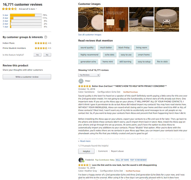 Each reviewer has a profile, so users can see what they say about that item and read other reviews they’ve left. In addition to reviews, there are Q&A areas on many products where people answer specific questions about the product.
On your site, add testimonials and either link to reviews of your products and brand or add the ability for users to add reviews. Making reviews readily available also adds credibility and shows you stand behind what you sell.
Hamburger Menu
 You may have heard hamburger menus are on the way out, but when a giant like Amazon still uses this navigation option on its website and via its app, I sit up and take notice. Most consumers instinctively understand clicking on this menu brings up more navigation options. Note above that when you click on Amazon’s hamburger menu, you see its most popular categories, such as Prime Video. Just under that are popular shopping categories. As a designer, you can repeat Amazon’s success by adding a mobile-friendly hamburger menu and highlighting the areas of your site users visit most often.
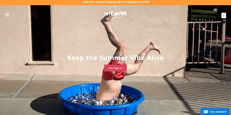
The hamburger menu appears in the upper left corner of ambsn’s e-commerce site. This site combines the use of many of Amazon’s elements, including a big hero image and simple navigation. The hamburger menu on the site is in the same location as Amazon’s. If you plan to reach mobile users, a hamburger menu is a nice feature for smaller screens, but it also translates well on larger ones.
Learn From Powerhouse Companies
Innovative companies like Amazon teach designers a lot. They spend a small fortune on testing and hiring experts. You can repeat their success without breaking your budget by merely studying what they do and the elements they keep in their designs. That’s what I did, and it really paid off.
Over time, your site will increase its conversions and usability, too. While it’s unlikely your website will reach the size or revenue of Amazon, you can still make tremendous improvements and grow as a brand — then make like a Seattle resident and treat yourself to a cup of coffee.
Lexie Lu is a freelance web designer. Lexie is a contributor to Marketo, Website Magazine and Envato. Check out her design blog, Design Roast, or follow her on Twitter @lexieludesigner.


