It’s not enough to sell delicious mouth watering food nowadays, the packaging is the first impression, so it needs to be great! The world of food packaging is moving towards simplicity and crazy colors this year. Sounds like a weird combo right? This perfect blend allows for a clear and to the point communication, along with playful elements and colors to tell your products’ story. Here are a few examples of the most creative packaging designs to get inspired and start the year off right.
Bright Gradients:
The colors keep coming! This time with different kind of gradient effects, from chill pastels to intense sunrise sky vibes. The Dulces de Barrio packaging design is an amazing case of gradients being the focal point of the product, while letting the gothic text stand out. Never thought candy packaging could be this sweet!
Flat Illustrations:
We’re seeing these flat illustrations everywhere this year, so they were bound to show up on our food packaging. This particular style of illustrations allows for simple shapes with plain colors stand out as minimal but beautiful designs. Tenzo Tea’s Matcha Tea packaging is a great example as to how flat illustrations are a perfect way to tell your product’s story in a harmonious, crisp and clear way.
Minimalism:
Although most brands are going for colorful packaging this year, there are some that stand out for their use of simple black and whites, with minimalist elements and simple text. Sometimes, keeping it simple is the best way to get your message across. In a sea of color, black and white might be the way to go this year. ILA’s ingredients come in a super simple packaging design, specifically these minimalist black containers for salt, honey and more.

Vintage Inspired:
Sometimes the old ways are the best ways. Brands are returning to their roots and taking on a vintage visual identity through their food packaging, incorporating hand crafted and artisan styles, with a retro mix of intricate typographies and detailed ornaments. Bones Coffee Company’s packaging is a clear example as to how taking on a vintage style can make your product stand out, while maintaining the brand’s identity throughout.

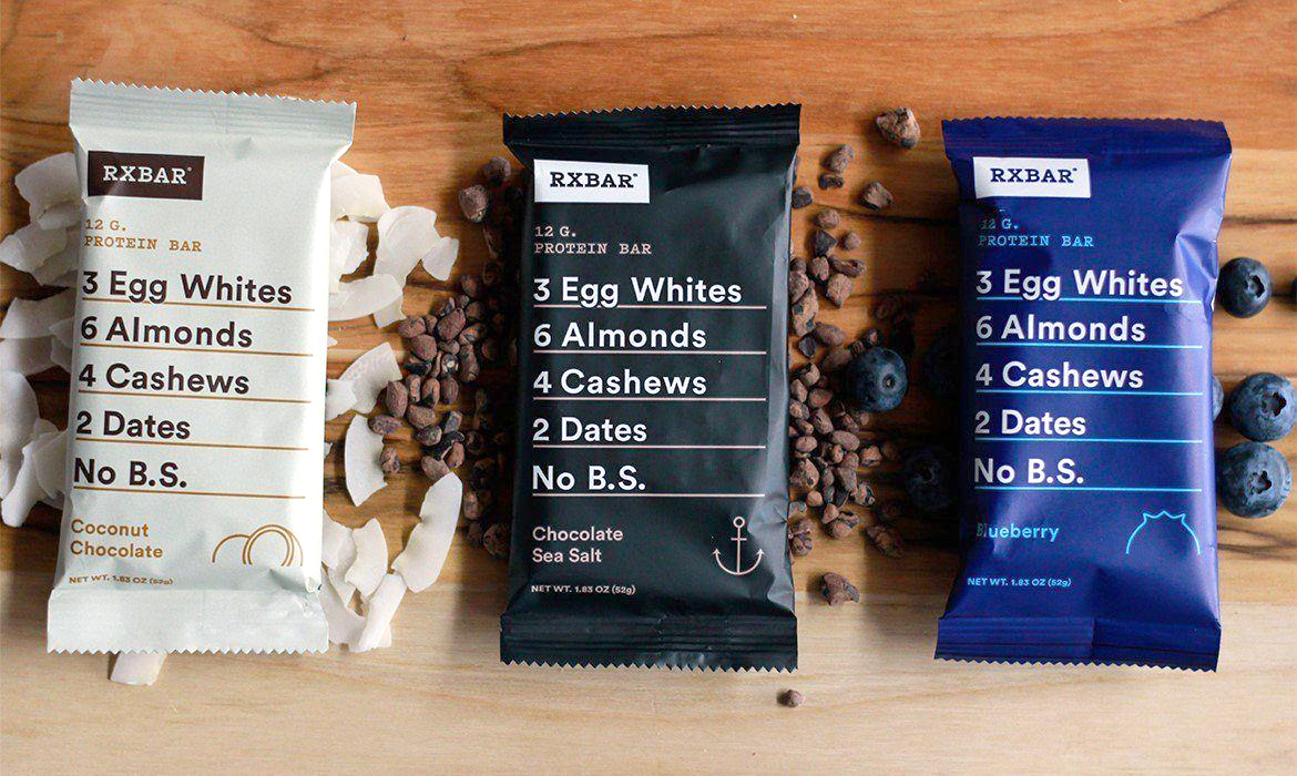
Plain Colors:
This is what we meant by a foolproof combination of colors and simplicity, it can’t get any simpler than this but that doesn’t mean it won’t catch your eye. RxBars are an excellent example as to how simplicity gets the point across, but still creates a memorable visual identity for the brand.
Plastic Free Materials:
The world is going green! Brands all over the world are looking to change over to sustainable packaging materials, like paper, cardboard, bio-plastics, and more. Everyday we learn about a new material we can use to make our packaging have less of an impact for the environment. Here it’s not so much about a visual look, but the fact that the brand is choosing a sustainable path, sometimes aligning with their customers’ lifestyle. Bacoa’s compostable food packaging is an amazing example as to how going green doesn’t mean sacrificing a Brand’s aesthetic.

Bold Typography:
Sometimes all you need is a big bold statement with unique typographies to catch your customers’ attention and tell your products’ story. Brouhaha Beer’s packaging is a cool example as to how keeping it simple with a bold font could really make your product stand out and make or a distinctive visual identity for your brand. Keeping the information short, sweet and to the point is sometimes the better way to go.

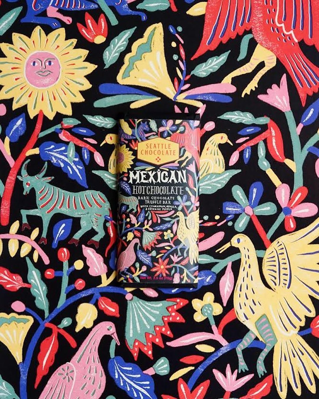
Pattern Frenzy:
This year we’ve noticed a bunch of brands going all out with intricate patterns, from abstract to botanic elements, they’ll make sure to tell your product’s story. Seattle Chocolates’ packaging is a cool example as to how these patterns can really make your product catch your customers’ attention. Patterns are interesting as they can allow for you to play around with elements that define your brand, or give off a certain vibe that attracts your consumers’ eye.
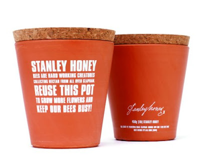
Reusables:
Another way to go green this year is to make your packaging reusable, causing little to no negative impact to the environment. Stanley Honey’s packaging is an amazing example as to how simple it can be to create a zero waste product, with honey being packaged in packaging that can later be used as a pot for your plants. Going green is big this year, and we’re all for it!
Crazy Shapes:
Sometimes having cool patterns or graphic designs on your packaging just isn’t enough. That’s where some brands like to experiment with shapes. Modular type packaging is on the rise, with all types of geometric shapes to watch out for. Astrobright’s Tea Packaging is an amazing example to showcase one of this year’s trends with triangular shapes that together can form a bunch of other ways to display the product.