A logo design is the basis of every company’s branding. Logos can easily be associated with the business, even if their name is not included in the design. Brand recognition and perception are fostered through a logo, making it one of the essential forms of communication to relay basic information about your brand.
Brand Design made easy using Design Templates! Read more about them here.
A logo can convey crucial business values like professionalism, trustworthiness, and quality if done right. It banks on uniqueness and needs to portray the brand identity and mission, whether in color or grayscale.
As 2019 comes to a close, 2020 will bring a new twist to graphic design, which gives an opportunity to spruce up company logos to welcome the new decade of design. Here are some of the trends that we believe will showcase the styles and colors set to pervade 2020.
Create your own company logo using our editable logo templates for Illustrator, or our online logo makers!
Sans-serif with a twist
For many decades, the Sans-serif font has been a favorite for companies because of its no-nonsense form. While it may be simplistic in nature, the sans serif does not have any complicated details that may be hard to read sized up or down.
Sans serif fonts are generally clean, modern and neutral. This font group is very versatile and readable, which are two great qualities to incorporate in custom logos. It’s one of the reasons why more and more large companies redesigned their logos using sans-serif type fonts.
Nostalgia is an emerging theme in upcoming logo trends, but brands are giving it their own spin by adding little elements that enhance the impact of the font. Using a sans-serif base, then infusing different styles and weights give texts a delightful twist and keep it futuristic, which is another theme to look out for in 2020.
Here are some examples of brands utilizing sans-serif type for the word mark but with a twist:
The Netherlands
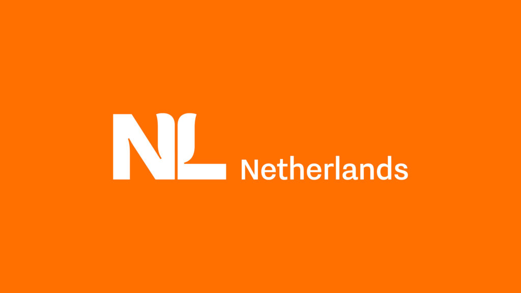
The Dutch government has recently rebranded from their old “Holland tulip” logo design to a crisper style using an embedded tulip petal on the block font, expressing the country’s icon subtly. It retains the orange color that represents the House of Orange, the Dutch royal family.
Kroger
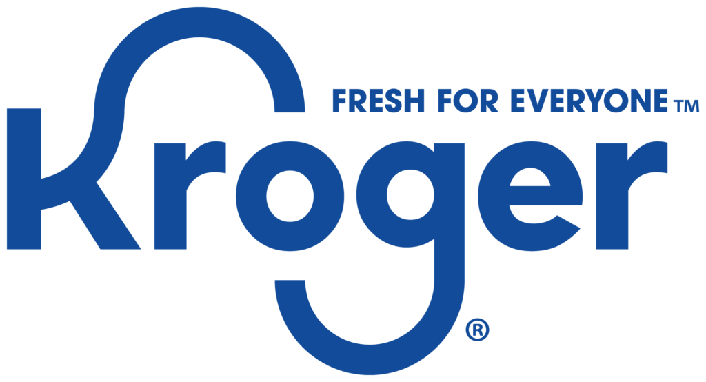
The new Kroger logo designed by DDB showcases the signature loops of the K and g letters, but with a sleeker appearance and a new tag that redefines the famous retail brand’s identity. The designers have opted for rounder structures and looser spacing between letters, enhancing the readability of the font they used.
Reebok
![]()
Another big brand that opted to remake their logo to get ready for the new decade is Reebok. The popular shoe company reintroduced its signature ‘90s vector logo via a collaboration with the brand’s in-house artists and Darrin Crescenzi, NY-based designer.
The nostalgia theme is strong in the new logo, along with a unique twist to its sans-serif style name. the Motter Tektura font offers sharp, recognizable details with more opened-up spacing that creates an eye-catching quality to the logo.
Modernized nostalgia
![]()
The classic retro style is edging into the trends, and many brands have started to bring it back to the limelight. Chunky shapes and crisp, clean images reminiscent of the ‘30s. Vintage layouts and typefaces are looking to become regular go-to styles in 2020.
Everything bold
![]()
Huge, on-point wordmarks and bold logo marks will sweep the trends by granting greater brand visibility. This style will work great in billboards and posters and offer better readability in scalable website logos. In 2020, designers will experiment on anything bold, from colors to illustration and typefaces that will induce memory retention and recognition for the brand.
Fluidity
![]()
The smooth switching of color gradients have been a staple in logo design in recent years and is poised to continue being at the top of the trends this new year. Gradual gradient shifting offers depth to an otherwise flat design and is a nod to the ‘80s retro-modern flair for surprising combinations that actually work.
Kinetic styles
![]()
Kinetic designs began surfacing in 2019 and will carry over to the next year. These logos involve interactivity and videos that depict a constant state of change, which defines the ever-moving and evolving world. Kinetics can also be applied to static designs using texts on paths, and dynamic shapes and patterns.
Creamy, soothing textures
![]()
Soft ice cream hues are enjoying upward popularity in ads today, which could very well extend to logos in 2020. Flecks of gold in pastel colors are the preferred color combinations that pop and give a satisfying aesthetic to logos, which will definitely capture anyone’s attention.
Conclusion
The future of logo design has almost arrived, and we hope that you will prepare and evaluate your brand’s logo to make sure it’s ready for your audience in 2020 and beyond. There is no shortage of creative options to make your logo 2020-ready, but whatever you choose to implement, remember that simplicity is the key!