When it comes to developing an online platform design is a key consideration. And this includes all of the different factors of the site, not just the overall design or feel of the site. Even small design choices such as icons can have a big impact on usability, user behaviour and even something as untrackable as the feel of the site.
With that in mind, here are some of the pros and cons of carefully considering your icon use in both app and website design.
What are Icons?
Icons are, in simple terms, an image which is used to communicate something to users.
The form of an icon can take many different shapes, all with a unique message encoded into it. Ideally, they are easy to remember and universally recognisable. Of course, in ancient times the use of icons was the basis of all languages. So our movement towards this more visual form of communication is perhaps not that much of a surprise.
The use of icons in modern web and app design is almost second-nature, as certain icons have become standardised. However, if you are considering the use of icons in your next project and how to apply them, then it is important to consider a few important factors. Especially in terms of the usability and UX side of icon use.
Icons for Usability
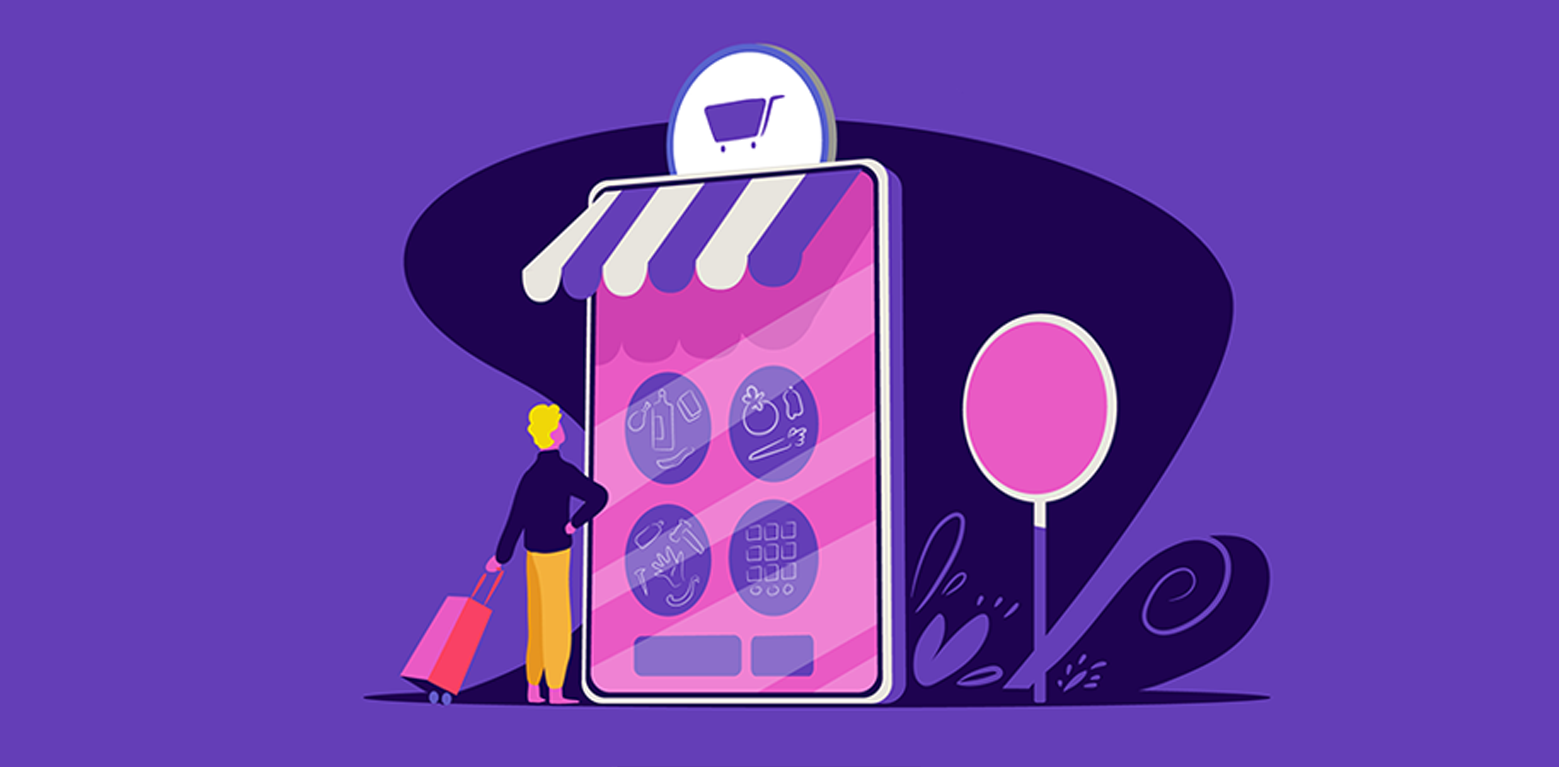
The most common implementation of icons on a website or app is for usability factors. It is surprising how much harder a site can be to navigate without recognised icons in place, an issue which is only exasperated further with apps. The overall use of icons can have a number of important benefits for the overall UX of your site or app.
Global Recognition Factor
The true value in icons is, of course, the recognition factor. Iconography is a global language; whether you realize you can speak that language or not.
At the moment, there are global standards for symbols that pertain to hazards, chemicals, traffic, etc. But, the syntax of regular symbols–even the emoji–has become part of the global vernacular. The reason for this is largely thanks to the internet. With a global source of conversation and transfer of information, we have unexpectedly developed a language independent of country borders.
Adapting your site or app in this way, then, can help you attract a more global audience.
Changes to Google Search
Recently, Google has updated the way in which they present search results on mobile devices. For example, here is the Vexels site in mobile Google search:
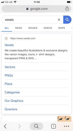
As you can see, there is now a small favicon next to the Vexels URL. This is a custom site icon and the more recognisable it is for your website, the better your appearance will be on Google Search results. It doesn’t necessarily have to be a custom icon either, as plenty of brands opt for unbranded icons in this instance, but it can be a nice addition to your sites overall appearance.
Final Thoughts
The use of icons in your web and app design is surprisingly a big factor to consider, though you may find that you use them almost intuitively. And if you’re in search of some good icons to use in your next project, then look no further than here at Vexels. The icon library is full to bursting with great imagery to apply to your next project!
About the Author: Zack Halliwell is a freelance writer in the business and marketing niche. He covers topics including mobile app development, social media marketing and freelancing. You can connect with him on Twitter @ZackHalliwell.