
All design improvements should base on objective and measurable data so that statistics can display your progress or mistakes. The most valuable metrics of UX efficiency is website conversion rate – the percentage of users who performed necessary actions. It can be a purchase, registration, signing up for a subscription, downloading trial software, or upgrading a free service.
Good UX aims at doing no harm and avoids disturbing user’s natural website journey
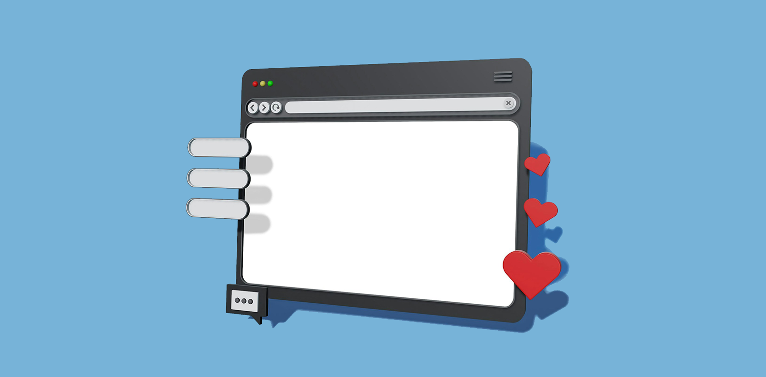
How does UX design influence the conversion rate?
Accessibility of a feature that leads to the desired action makes a difference between completed and abandoned purchases. A user can be convinced about the product’s quality or offer’s attractiveness, but if the finalization of the purchase requires 10-12 clicks, you can expect to lose a lot of clients on the way.
Website design conversion rate 2020: Web Design Best Practices
Web standards are constantly changing, so revisiting your UX practices each year is the key to success. Let’s see what web design practices you should implement in 2020 to your website’s conversion rate.
1. Well thought out UX
Thinking should always proceed implementation, and in the case of UX, it’s undoubtedly accurate.
- Know what to fix. Go to Google Analytics and define ‘useless’ page elements – see what pages have the highest bounce rate, check if you have buttons with low click rates, etc.
- Before you start changing the website’s code, create a detailed plan of all changes and make a mindmap with the full website structure.
- Find out the needs of your audience. UX design is based on a careful study of customer psychology. Even if you find your website comfortable, the audience might not share the opinion. Perform A/B testing – change one element on the site and see how it affects conversion rate.
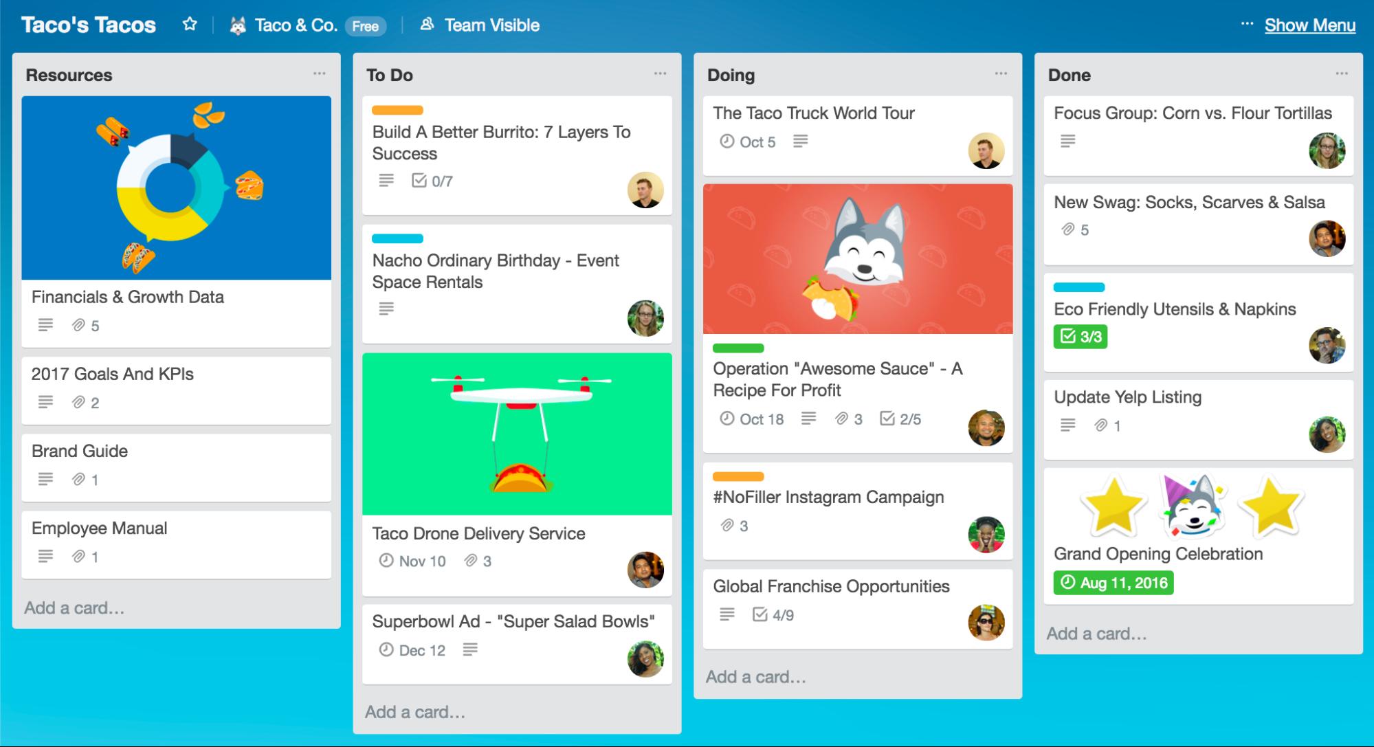
Trello is a classic example of an amazing UX, based on users’ habits and needs
By assessing the needs of your audience and defining previous mistakes, you save time and money from unimpactful changes. Research on the early stages of UX development lays the ground for implementing improved software development and design methodologies.
2. Highly visible call-to-action buttons
It’s a general practice that CTA buttons should stand out in the website content and be accessible to a user. The most challenging part is to make the CTA button disruptive but not disturbing. We analyzed recent statistics and research – and here are the results.
Research different color combinations for your button and measure the conversation rate after each change. Matthew Woodward, a marketer, researched the efficiency of 4 differently colored buttons before making the final change.
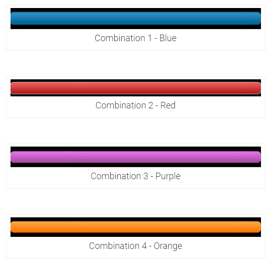
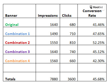
The marketer has created four color combinations and tested each of them one by one
Experiment with font colors. As the research from MidasMedia has shown, it’s better to stick to classic combinations rather than experimenting with bright colors.
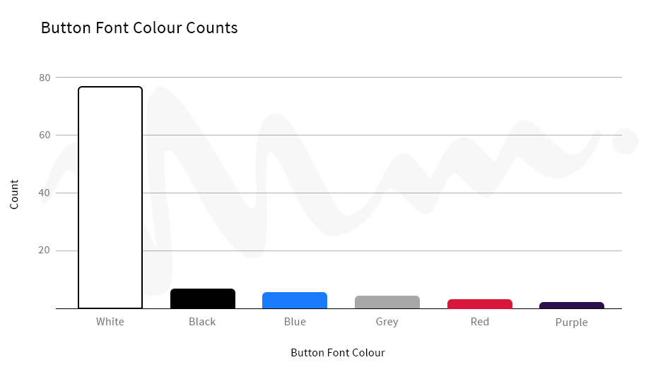
White color is a universally preferred choice
If the background color can be bright, the font should be neutral to keep the CTA text readable.
3. Mobile-friendly pages
We analyzed a recent report, created by Google, where UX experts share main tips of mobile version optimization. Here are the main takeaways.
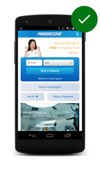
The actions should be available on the first screen. On the desktop version, developers and designers often put sliders or a large banner with the company’s name and slogan. This upper section takes only a small portion of the first screen on a big computer screen, but it’s not the case for the mobile version.
You need to optimize your sliders and banners to mobile design standards. Otherwise, the users won’t be able to take a good look at the website.

The designers of the second website did not take their time to adapt the page to mobile web standards
In the first example, users can perform the desired action straight on the main page. The second one, on the other hand, offers a vague CTA (‘Learn more’ gives no information to a user) and the picture takes up valuable space.
4. Don’t burn bridges to the main page
Users should be able to go to the homepage at any point of the experience. You want to give users control over their experience, and this means, keeping the main page accessible at all times. The easiest way of doing so is putting your company’s logo at the left top corner of the page.
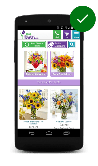
By clicking on ‘1000 Flowers’, a customer can always return to the main page
5. Aim to provide the fullest experience
You can decrease the number of promotions and design gimmicks, but the core user experience has to remain accessible for computer users.
- Search filters should be as versatile and customizable as on the desktop website.
- Enable synchronization – users should be able to finish a payment transaction on another device;
- Implement real-time form validation to avoid database errors;
- Add a zoom-in feature for product photos;
- Enable both horizontal and vertical orientation.
Don’t consider the desktop version to be your main one, and the mobile one to be secondary.
6. Well-polished content
Design and content work for the same goal, equally contributing to the increase of conversion rate. Here is our list of main tips for using content to your advantage.
- Keep a structure. Pages should be divided into categories and subcategories and link to each other.
- Maintain a distinct tone of voice. Just as your UX should be unique, your company’s writing manner should remain consistent. Decide whether you want to keep a conversational or formal style depending on your customers’ preferences.
- Use clear sentences and visuals. The text has to deliver the intended messages. Tools like Grammarly and Hemingway App help you to assess the clarity and delivery quality of the content.
After you’ve improved the quality of the text, work on formatting. Headlines and section headers should be underlined and communicate the key message of the text. Just by scrolling the text, the user should have an idea of what’s it all about.
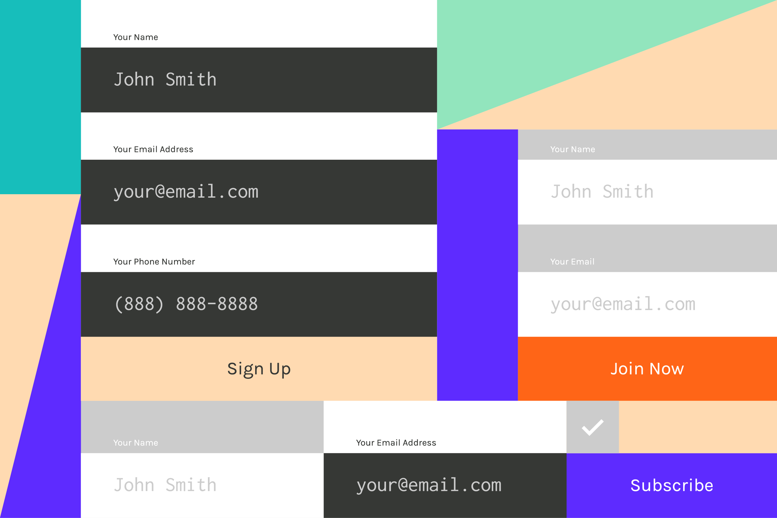
7. Short contact forms
Luckily, privacy-protection policies motivate companies to reduce the amount of collected private information which contributed to the shortening of contact forms.
The rule of thumb is: you need only a name and contact information from a user. Anything other than that can be an obstacle to the finalization of the conversion action.
Additional design tips
- Center the fields to the left side, increasing the readability;
- Keep the page clean by maintaining consistent spacing standards
- Focus users on the first field by emphasizing it with a bolder border-color;
- Never use Caps Lock.
The easiest way to determine whether the contact form works is by putting yourself in the user’s shoes. Analyze the competition and fill out at least 5-10 forms to see which creative solutions work and which don’t.
8. Develop a UX methodology
Integrate design-thinking methodologies into your work. The design should be one of your priorities and lie at the core of other processes – marketing, communication, PR, client support. This means constant problem detection and solution development.
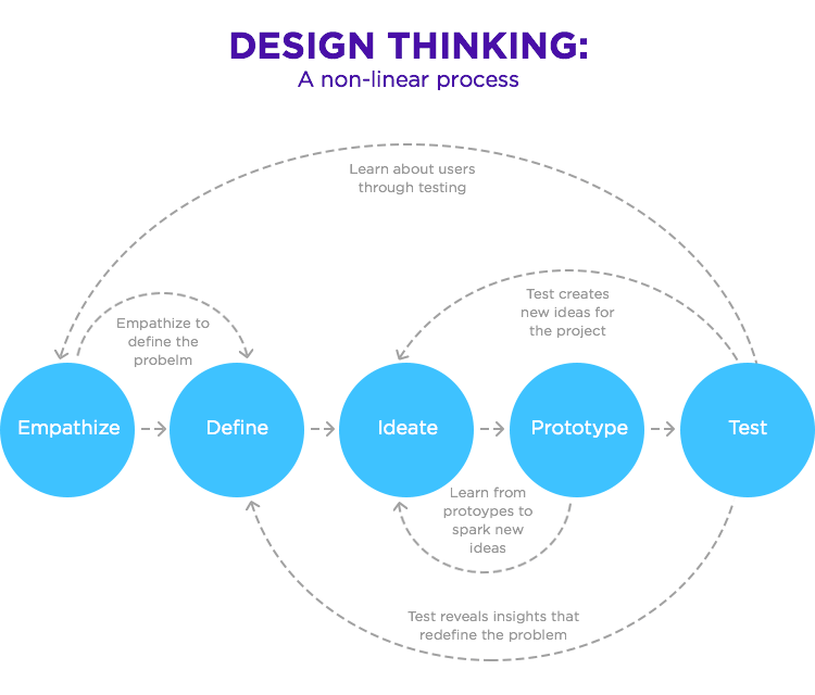
This process doesn’t stop with the release of a final UX-design version
After you’ve defined the problem, ideated the prototype, and tested the solution, start implementing changes one by one. If you change the page entirely, you’ll never know what improvements have contributed to conversion’s growth.
9. Page loading speed is a key factor
According to Google’s Insights, 53% of page visits will be cancelled by a user if the page loads more than 3 seconds. If your page loads more than 5-6 seconds, you risk losing half of your potential buying audience.
Getting your web page up to speed is easier if you have a toolkit for collecting insights and automating the page optimization. Our favorite page speed optimization tools are:
- PageSpeed Insights – the tool analyzes how much time it takes for the page to load and how it affects the users’ behavior.
- WebPageTest runs a free website speed test to measure and analyze the performance of the website.
- Accelerated Mobile Pages – an Open Source software for improving the page load speed on mobile versions.
By assessing your current page load, executing changes in scripts and design elements, monitoring the changes in users’ behavior and conversion rates, you can optimize the web experience of the potential customer.
Bottom line
According to Google’s research study, today’s users are goal-oriented. They want to get the result immediately. Providing customer with a feeling of control over the situation is a primary objective of a good UX. You keep guiding the user to the desired action but do it quickly and smoothly, so website visitors don’t feel pressured to make a decision.
After you’ve defined the areas of improvements, and designed the solutions, put yourself in your users’ shoes and test every feature. If you are satisfied with a beta-version, it’s time to implement the improvements to the actual website one by one. Test how customers react to these changes by monitoring the metrics. Never stop identifying problems and looking for solutions – this is how you’ll achieve your highest conversion rates.
About the Authors: DDI Development company brings a unique combination of e-business experience and solid technical proficiency to provide high-quality web and mobile digital solutions in a friendly and creative way. We help businesses achieve their goals by offering professional services. Our expertise spans into several industries including e-commerce, CRMs, e-learning platforms, recruitment and financial systems, etc. Our experienced team has delivered 150+ completed projects.

