Infographics are reportedly the best performing visual content format on social media.
That, along with several other stats about the viral potential of infographics has convinced most marketers to create their own.
While the inclusion of visuals in your marketing strategy is a great idea, the truth is, not all infographics are created equal.
If you have been wondering what is inhibiting your infographics from going viral, one or a combination of the following points may be the culprit.
You Plan Of Promotion Is Flawed
Your awesome infographic will obviously not go viral if people don’t know about it.
With that said, many times, the process of creating a great infographic is so engrossing, that the promotion plan takes a back seat.
However, that can be a grave mistake that can prevent your infographic from getting the attention it deserves.
You should start thinking about the promotion plan right at the idea inception stage.
Think about who will benefit the most from the information contained within your infographic? Who will relate to it? Which platforms are these people using? What devices are they using? Which influencers are they following?
Having a bulletproof backlinking and promotion plan for your infographic will ensure if catches the right eyeballs as soon as it is released. Once you achieve this visibility, the infographic will have much better chances of going viral.
Here are a few things you can do to promote your infographic:
Share Aggressively
If you think your infographic will get the “viral” kind of fame with just one round of sharing, you may be wrong. If you have invested time and money in creating an infographic, make sure you invest the time in sharing it, as many times as it takes.
This doesn’t mean you should spam your followers and email subscribers with the news of the infographic. However, it is crucial to at least mention it 2-3 times to ensure it reaches a significant portion of your audience.
Have A Social Media Promotion Plan In Place
Studies have found that infographics are liked and shared on social media 3X more than other any other type of content. Infographics clearly do great when it comes to social media performance, and it is only fair to take advantage of the same.
When you create an infographic, make sure you don’t just share it on your social media channels, but also on the various social media groups that may feature a relevant audience. For instance, if you have made an infographic about the evolution of the smartphone, it makes sense to share it on tech groups and social media pages that talk about gadgets.
This way, your infographic will be visible to relevant audiences that don’t necessarily follow your brand on social media.

Share The Infographics With Relevant Webmasters
If done right, this little trick is the most efficient way to make your infographic visible to the right people. The task is quite simple, identify credible (niche relevant) blogs that are talking about a relevant subject.
For instance, if you make an infographic about the process of changing a car battery, it will be a great idea to reach out to automobile blogs that cater to new car owners.
The best way to go about this is to simply send the relevant webmasters an email informing them about your infographic, and how it would be a great addition to their content.
You’re Not Making It Easy To Share Your Infographic
You created an infographic. Shared it with your email list. Shared it on your social media channels. Shared it with other authority websites in your niche. These steps drove substantial traffic to your website, where the infographic lives. Now what?
The steps taken in the last section only ensure that your infographic gets the initial attention it needs in order to go viral.
Once the first few visitors find your infographic, it is time to convince them to share the infographic within their social circles. Ideally, you want to start a “chain reaction” of shares for your infographic.
How do you do that? The following steps may help:
Add Supporting Copy To Your Infographic
Think about it, a single infographic living on a webpage with no context whatsoever will never intrigue anyone enough to motivate them to share it on their channels.
A short copy will help put the information in the infographic into context, possibly making it more relatable for the visitors.
This is also an excellent opportunity to add a clever and subtle CTA to the page by asking the visitors to share the infographic if they found it entertaining or helpful.
Add Social Sharing Buttons
If someone wants to share your infographic, make life easier for them by placing social sharing buttons on the infographic landing page.
If someone simply views your infographic, remind them to share it with their friends by placing social sharing buttons on the infographic landing page.
The case for the usefulness of social sharing buttons is bulletproof, and they are an indispensable part of an infographic landing page.
Bottom line, if you want people to share your infographic, you will have to ask them. For best results, don’t limit this rule to the infographic landing page. Drop a line about sharing the infographic in all possible communication related to the infographic.
Your Infographic Content Is Helping Your Brand Instead Of Helping Your Audience
Content marketing is all about becoming visible to the ideal consumers and leading them to a favorable purchase decision by proving that your product/service is the ideal solution to their problem.
For this reason, infographics that blatantly promote a product/service rarely do well.
It is essential to understand that the job of the infographic is one, or a combination of, the following:

- Make prospects aware of your brand
- Educate them about a problem (and its solution)
- Provide your audience with actionable information that is relevant to them
- Position your brand as a credible source of authentic and entertaining information
Being in the business of SEO, something about the future of SEO makes perfect sense in terms of relevance. Moreover, the infographic lists the views of 25 top industry experts that are giving out actionable information.
The infographic checks all the boxes of the purpose of an infographic. And that’s why, it did well.
It generated over 3,000 likes on Facebook alone and was shared over 2,000 times. The infographic established RankWatch as a source of credible information, and drove tons of leads into the conversion funnels.
Do you think an infographic about why RankWatch is the best SEO tool would have performed this well?
Your Infographic Does Not Tell A Story
Infographics, just like any other form of content, need to tell a story. If your infographic does not tell a story, it is merely a bunch of information crammed in with pie charts and bar graphs.
When you create a story around the information you want to present, it becomes relatable, and relatable content has viral potential.
Try the following steps to add an element of storytelling to your infographic:
Step 1: Create A Single Focus
Almost every good story revolves around a single axis. In the case of an infographic, the story needs to focus on a single subject. For example, this infographic created by Crackitt talks about a very specific subject, building trust with your client.
This infographic addresses a very specific problem and gives actionable insight into the solution. If, say, they also wanted to talk about building the credibility of a brand or ensuring great customer service, they can go on to create a series of infographics.
To find the “axis” of your story, you need to have an in-depth understanding of your ideal consumer. What are their problems? What are their pain points?
Once you understand this, you can choose any one of the most relevant subjects as the focus of your story.
Step 2: Accumulating Relevant Data Points
Data points and statistics don’t add credibility to your claims but work wonders in getting the visitors interested in knowing more.
For instance, if an infographic about enhancing your ability to concentrate led with the fact that our attention span is lower than that of a goldfish, it would automatically get you interested in knowing more.
That being said, it is crucial to use these data points with care. Use too many data points, and you will turn your infographic into a scholarly article.
When choosing data points to use, make sure each one serves a purpose in your story. This way, you will only use the most relevant data, and it will be easier to place it strategically to maintain the interest of the reader.
Step 3: Create A Structure
Every story has a beginning, a plot, and a conclusion. Similarly, your infographic needs to have a structure to effectively tell a story. Ideally, your infographic should be structured in the following manner:
Introduction to the topic in focus ⇉ Data points and their context ⇉ Takeaways after every chunk of information ⇉ A clear, actionable conclusion at the end.
Now that we have taken care of the “info” part of the infographic, let’s move on to the graphics.
There Is A Flaw In Your Design
A good design is perhaps the most essential element for an infographic.
The design doesn’t just present the information in a visually appealing manner, it is supposed to complement the information, make it more interesting and relatable.
The following design best practices are usually a great starting point:
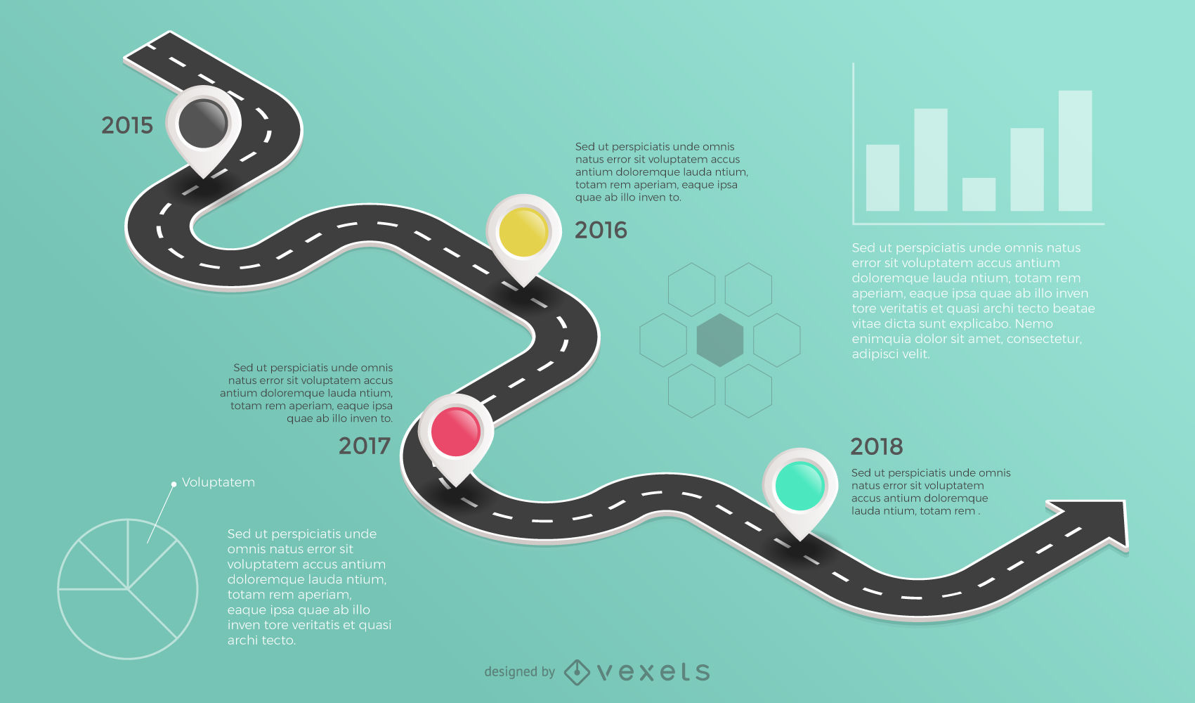
- Create A Flow Of Information: A good design guides the user through the information in a logical manner. This infographic does this beautifully by leading the reader through a “track” dotted with information.
- Ensure Colour Consistency: Colours have a significant impact on an infographic. To maintain consistency, it is best to stick with a maximum of five different colours. Use contrasting colours to make headlines and important data points pop. Contrasting colours also work great for comparisons.
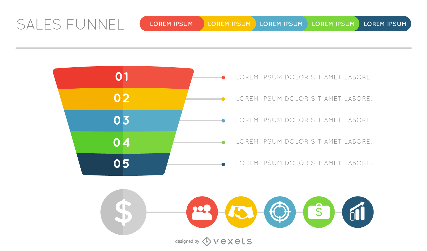
- Make The Right Use Of Data Visualisation Tools: Data visualisation is not just about presenting data in a visually appealing manner, it is about presenting it effectively. For simple proportions, donut charts and pictographs work best. Change is best depicted with timelines, line graphs, and map charts. Bar charts and pie charts depict comparisons efficiently.
- Pay Attention To Typography And Font Size: Different fonts and typography are great tools to create a flow within the infographic while making it visually appealing. Bold typography and larger fonts will attract the attention of the user. If they are followed by more smaller fonts, the reader’s attention will be guided accordingly.
- Stay Minimal: When your objective is to introduce focus, minimal designs work wonders. While including lots of information and different graphic styles may seem tempting, too many elements will do more harm than good. Stick with limited copy and consistent design elements to reinforce focus within your infographic, while making it look professional.
Conclusion
Making infographics is no rocket science. It isn’t a monumental task to execute, and there is no set formula for success.
That being said, with so many infographics being created these days, your design, presentation, and information needs to be absolutely impeccable. Moreover, producing a beautiful and informative infographic is only the first part of the process.
If you want your awesome infographics to go viral, they will need the support of an equally awesome marketing plan.