Business cards are a great way of directly marketing your business however, color psychology has a big impact on how your target audience perceives your business card. So, if you want to get the most out of your business cards, then you must examine which colors fit best.
In fact, experts at The American Genius reveal that people are 10 times more likely to keep longer a colored business card than a standard one.
Moreover, despite the fact that choosing the best colors for your business cards enhances their performance, selecting the wrong colors can also damage it. Why? Because your cards turn out to be of less interest to your target audience and may keep them on their desk for ages without taking action or even throw them away.
So, color psychology gives you the golden opportunity of using colors strategically in your business card marketing campaign. And helps you to attract your target audience to your business. How? By connecting with them emotionally through your business cards and expose them to your offers or services.
What is Color Psychology?
Color psychology refers to how different colors influence human moods, feelings, emotions, and behaviors. Let me explain; it examines how color influences the daily decisions of different people like the products they buy or if color influences people on supporting a particular brand?
This helps you determine how to use different colors in your business cards marketing campaign that will attract customers to your business. Because the right color for the right audience impresses them and works wonders.
Look at this: A research by credit donkey shows that every 2000 cards given out lead to a 2.5% sales increase thus bringing in more revenue.
Best of all, after understanding the role of different colors in delivering various messages, then color psychology helps you in choosing the right color that expresses your brand’s identity. And win your target audience’s attention.
Here are some colors and the messages they convey:
- Grey is perceived as calm and natural.
- Orange conveys cheer and confidence.
- Red is associated with energy danger, and passion.
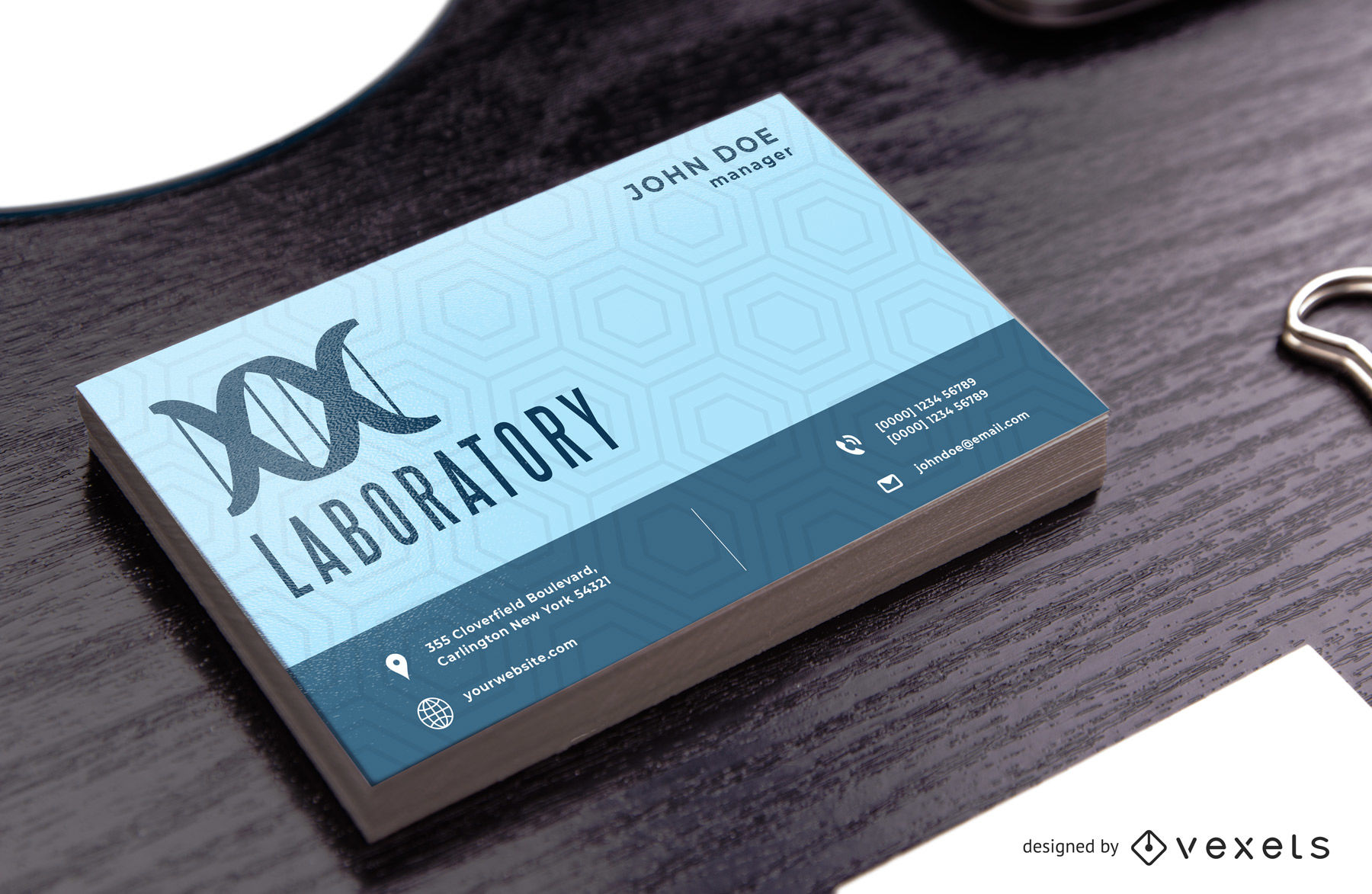
- Blue conveys dependability and strength.
- Yellow shows optimism, happiness, and warmth.
- Green is for peace, health, nature, and growth.
However, there are things you must consider as you choose colors for your business cards to ensure the success of your direct marketing campaign.
5 Things To Consider When Choosing Colors For Your Business Cards
1. Target Audience
You have to consider who you want to talk to. Are you marketing to Kids, adults, lawyers or any other specific group of people because all have different colors that can capture their attention?
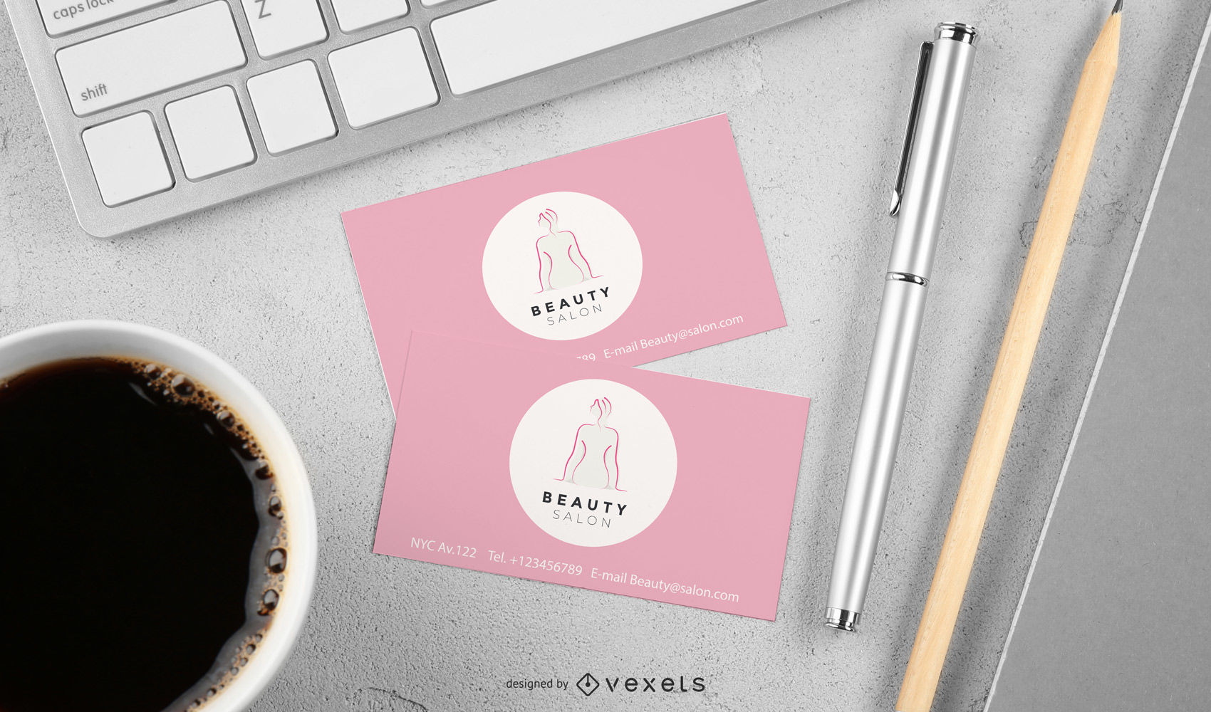
For example, fun and lively colors like red and yellow are more appropriate for children, whereas pink is the best fit for ladies and blue for men. So, choosing the relevant color for your target audience plays a big part in winning their attention. And increases the chances of customers accepting your business cards and keep them for future reference if they ever need your services.
2. Competitors
Is your market oversaturated? You can decide to choose unique colors different from what your competitors are using. Why does this matter? It helps you to stand out from the crowd.
Standing out from the crowd needs unique moves. So, by examining the color of your competitors’ business cards, you are able to come up with a unique color different from theirs. This gives your business cards the power to capture the attention of your target audience over theirs.
Think about it: Like if you are in the real estate business and your competitors have black and white business cards, yet yours have unique designs such as mix and match. Then yours will stand out.
On the other hand, if the performance of your competitors’ business cards is good, then you can decide to use the same color. Why? Because it’s the best fit as you have the same target audience and the customers have already embraced the color.
3. Cultural Differences
Different colors have different meanings to various people all over the world. So, you have to look at how your target market perceives a specific color. For example, in South Africa red is perceived as a mourning color yet in China it’s perceived as good luck.
More so, in America, green is associated with money because it’s the color of dollar bills which isn’t the case in other countries.
So, you have to examine your target audience and how they interpret different colors and you need to be color sensitive according to your place of operation. Moreover, with time, colors can change in significance for example, blue used to be a feminine color for girls while pink was a masculine color. Thus, you must be up to date with the current color significance.
4. Business Card Paper
The color you choose must be compatible with the type of paper you are going to use for your cards. Let’s say you are to use a thicker stock card then vibrant colors are the best fit. Why? Because the thicker stock prevents any color bleeding. But, if you are to use something thinner, then you should consider using monochrome design.
Furthermore, business card paper should be considered because it impacts on how your chosen color improves the readability of your business card. Here’s how; if you choose reflective colors like black and dark blue, you have to take care while choosing the colors of your words. As they can be difficult to read if not well selected.
5. Brand personality
Is your brand modern or classic or is it feminine or masculine? You need to look at your brand personality and select the best color fit for your brand identity. Here’s what I mean; as a brand, you must promote a strong emotional connection with your target audience or customers because emotions are powerful and drive decision making.

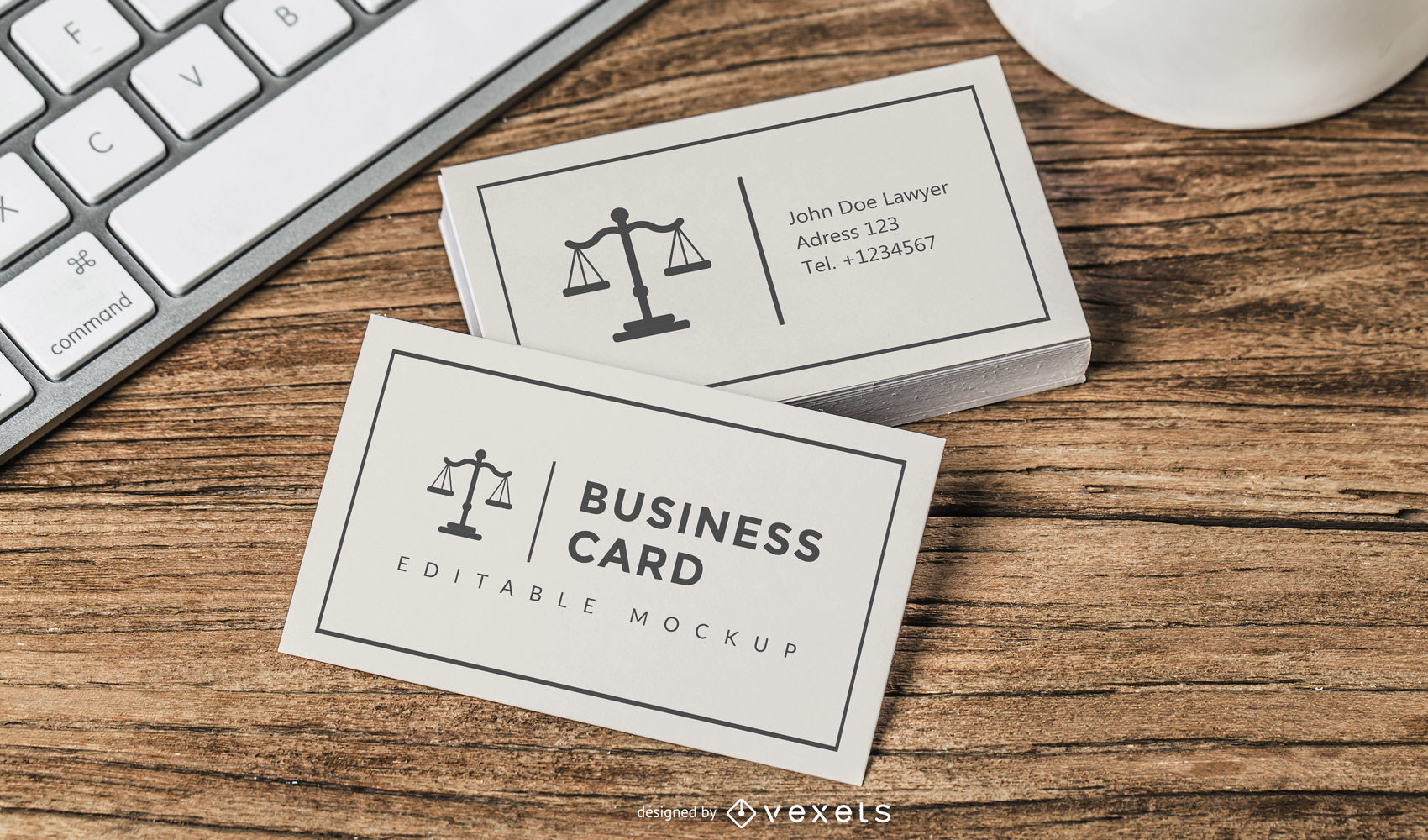
By the way, you have to keep in mind that the colors you choose for your business cards should have a connection to your services. For example, blue and grey are the best-fit colors for businesses like law firms as they represent reliability.
Get The Most Out of Your Business Cards
So as to win at business cards marketing, you should always aim at having the best quality cards. And this is a combination of the best fit colors and quality paper because your customers judge your company based on the quality of your business cards.
As a matter of fact, 72% of people judge a company according to its business card quality. Not just that, 39% of customers decide not to deal with a company if they don’t like its business cards.
Understanding how your audience psychologically different colors are key to knowing the best color fit for your business cards.
Applying color psychology to your business cards is a perfect move-in ensuring the success of your direct marketing campaign by attracting your target audience.
About the author: Smith Willas is a freelance writer, blogger, and digital media journalist. He has a management degree in Supply Chain & Operations Management and Marketing and boasts a wide-ranging background in digital media.