Photo by Kaboompics .com from Pexels
Typography is an art form all its own. Clever logos, appealing web designs, and eye-catching posters all benefit from a pop of well-designed text. Typography takes your message and transcends language barriers to convey ideas about brand and messaging just through the shape and treatment of the type.
Graphic design trends are always changing. If you truly want to keep your finger on the pulse of design, you must watch more than just popular logos or web site changes. Typography is a critical part of design and it also morphs and changes with the times.
So, to keep your web designs on the cutting edge of graphic design trends, let’s predict the future: what’s coming up for typography in web design in 2020?
Chunky type with overlays
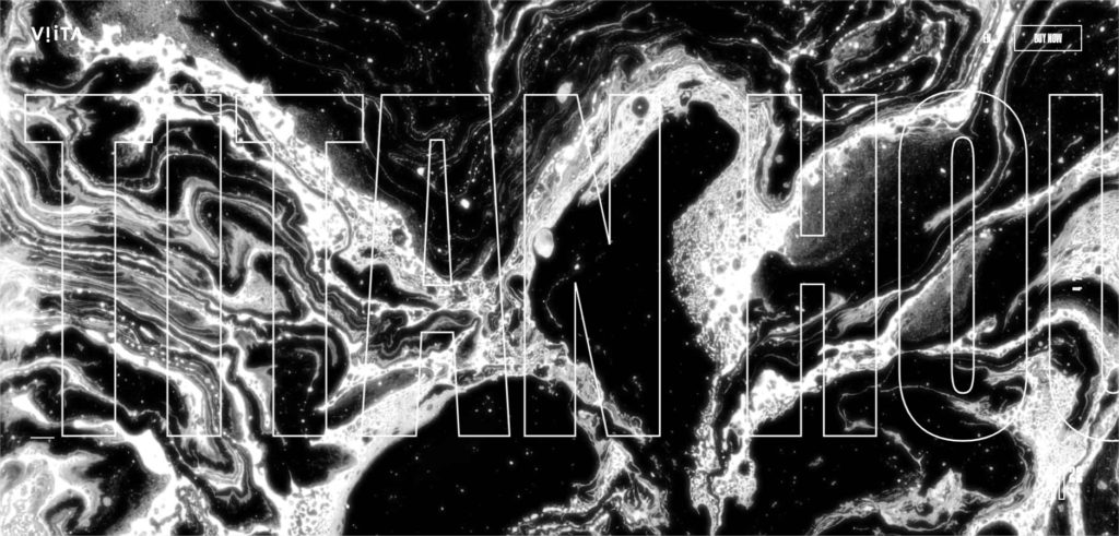
Source: Viita Watches
Typography captures an idea using written words, but the best use of type is when you can convey an idea even to someone who doesn’t speak your language. An interesting trend in type is taking this idea quite literally. Using black or large, chunky fonts, the trend involves overlaying images directly into the type.
This creates an interesting visual. You know the saying, a picture is worth a thousand words, right? Well, imagine how much of a story you can tell with a little photography sprinkled into your text.
This effect is great for hero images and can be simply implemented using the mask-image CSS property.
Skinny sans-serif
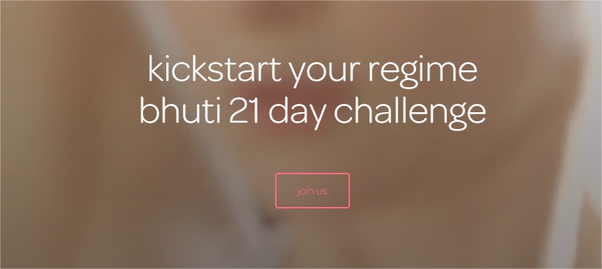
Source: bhuti.co
The skinny, light sans-serif font is a tried and true sight in the world of web design and branding. Its sleek lines look modern, classy, and effortlessly respectable. Thin, sans-serif fonts look great with any logo type and work astonishingly well for both headings and navigation text.
It seems like ever since Helvetica hit the scene as a crowd-pleaser, designers have turned to the light sans-serif font as a perfect accompaniment for a huge variety of brands and websites. This is for good reason—it just looks great!
Honestly, light sans-serif fonts are some of the easiest to match. No matter which typography trend you’re incorporating into your design, a light sans-serif font could find an easy home in your project.
Some may say it’s the easy way out—but, really, we should all just work smarter, not harder, right? Why fix what’s not broken?
Shrunken hero type
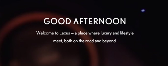
Source: DiscoverLexus.com
For a while, the trend was the bigger the better. Web-users were inundated with gigantic hero images and their equally giga-sized text that took up the entire front of a web site to the fold. The messages were big, bold, and visually loud.
They also weren’t the best for user experience.
Luckily, it seems like we’re turning back the font size clock on this monstrous type. The font size on hero images is shrinking rapidly. This not only makes it easier to fit more information before the web fold, but it makes your life a lot easier when developing for mobile as well.
I think we’ve all run into that issue where our dramatic typography just doesn’t translate well to small devices and our overall design aesthetic loses something in the adjustment. With smaller hero type, the transition isn’t so stark, so thinking responsive is just that much easier.
Hand-lettered calligraphy
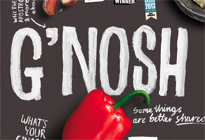
Source: G’nosh
The pixel-perfect look of flat design has fallen out of favor for a more human approach. When you design for the web, it’s a constant struggle to convey your brand in a human way. The more sincere your connections are with your viewers; the better your site’s results tend to be.
Since so much business is done online, many companies and websites are looking for ways to soften their brand to a “friendly face” in a digital space.
Hand-lettered calligraphy is a great way to convey this. Now, this doesn’t necessarily mean calligraphy in the most traditional sense—there’s no Olde English here. Instead, the trend involves headlines, fonts, or logos that look like they were created using traditional media and a human hand. There’s a level of imperfection in the loopy, friendly strokes that feels less computer-generated.
This trend looks great in all types of design, from web design to t-shirts and posters, so it’s great to incorporate in an overall branding look.
Grungy attitude
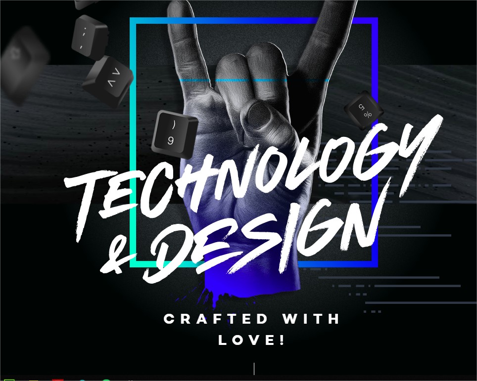
Source: 9elements.com
Politically, it seems like the younger generations are getting a little punk rock. It’s an age of speaking your mind, rebellion, and edginess that has found its way into typographical trends. Think bold, black fonts with weathering, ink splats, or bleeding edges.
Grunge doesn’t have to have an aggressive appearance to it. For a lighter approach, the grunge aesthetic is seen applied through fonts with bristled brush strokes. This makes a handwritten approach feel real, vibrant, and passionate.
This approach works well for websites that are geared towards younger demographics or brands with a bit of an edge. Other websites that could benefit from a grunge treatment would be ones themed around music or art. A little bit of edge can go a long way to upping your site’s cool factor.
Brutalism
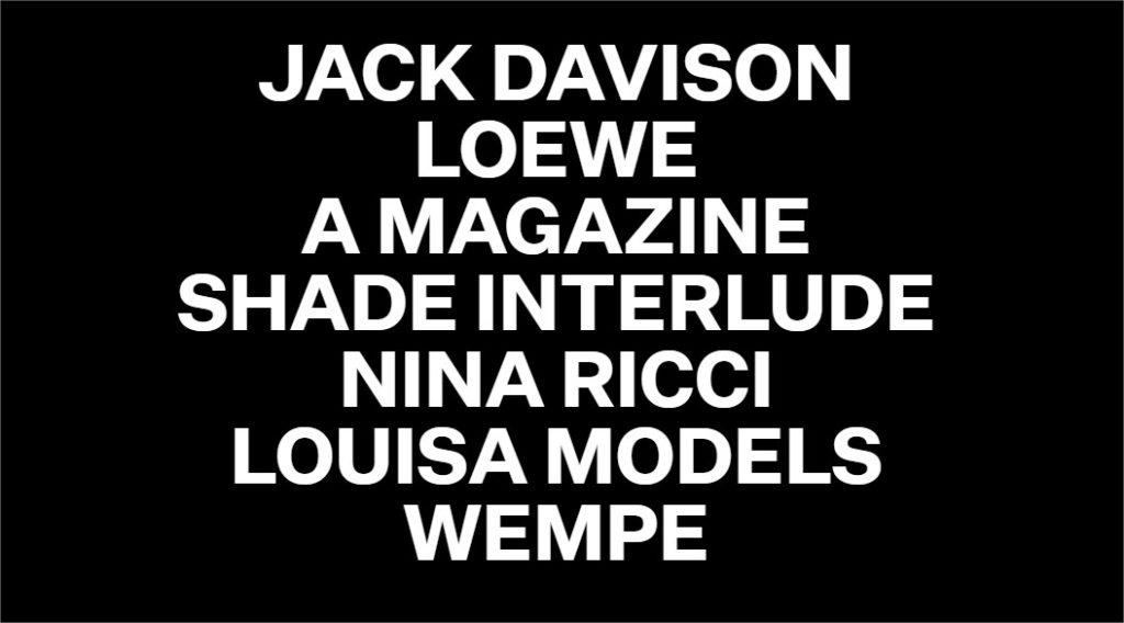
Source: Tavanovincent.com
You may be familiar with the concept of brutalist architecture. It came into the scene in the 1950’s and 1960’s and is characterized by structures with sharp edges, plain appearances, and a lot of concrete slabs. It’s drab, functional, and also has an air of oppressiveness to it.
So, taking this concept to typography, you’ll often see blocky fonts and typesetting that feels a little raw or unpolished. It’s a broad style choice, but it’s often seen in print design on eye-catching posters. So, for web design, you’ll see it in unconventional layouts and websites that look to make bold statements.
Animated type
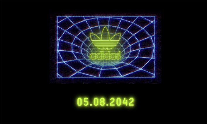
Source: hypebeast.com
We’ve all seen the slick slide or fade-in of type on a hero slider. CSS3 and HTML5 are crazy powerful though, so many developers are pushing their type animations far beyond the conventional. Animated type can take a boring design and elevate it to a far more interactive and immersive experience.
For example, let’s say that your site’s theme would work well with some neon light treatment. Using animation, you can not only light that type up but cause it to flicker or wiggle when interacted with.
Add a sense of mystery to your site by using a pixel-styled font and animate your text writing onto the screen after a cursor. Then, add a cool flash or jitter to the text to give it a glitching feel. This would be an amazing look for a mystery writer, short film, or any brand that wants to up the creep factor.
For an effective look on your blog, how about type that is highlighted by a low-opacity border or bracket when hovered over, which will draw major attention to your message?
Animations are surprisingly simple to implement and can take your typographical efforts to new levels. After all, we’ve moved far away from the world of print—why should our text be stagnant?
In conclusion
It’s an exciting time in web design. As more and more designers are breaking out of the confines of template sites and pushing the boundaries into exciting new frontiers, we’re going to see more of what typography can really do.
Thanks to the beauty of web fonts and the power of CSS3 and HTML5, we can look forward to years of interactive typography trends that far exceed anything print can do. Your website can take a written message and, with a simple overlay or animation, convey more in just a few words than in a sea of paragraphs.
Typography is an incredibly exciting field and the web is pushing the boundary faster than ever. While you certainly don’t have to incorporate every trend into the sites you design, try and find some that work for you.
Some, like light sans-serif fonts, are timeless, others a passing trend—but any of these ideas will give your website a visual, typographical punch-up that is sure to impress.


