- Thanks to globalization and the internet, new enterprises are springing up by the hour all over the world. The one thing that all of these new business ventures have in common is that each wants unique brand identity. And nothing establishes identity like a powerful logo. Needless to say, the going has never been this good for graphic designers. The incessant demand provides numerous opportunities to capitalize on. There is one thing in short supply though. Inspiration. How to make a logo that stands out, conveys the message of the brand and is memorable.
Well, while there is no replacement for talent and skill, but as far as inspiration is concerned, we might be able to help. Here are some of the finest example of brand logos, developed by contemporary designers for young brands. They encapsulate the timeless traditions as well as the latest trends. So go ahead, get inspired!
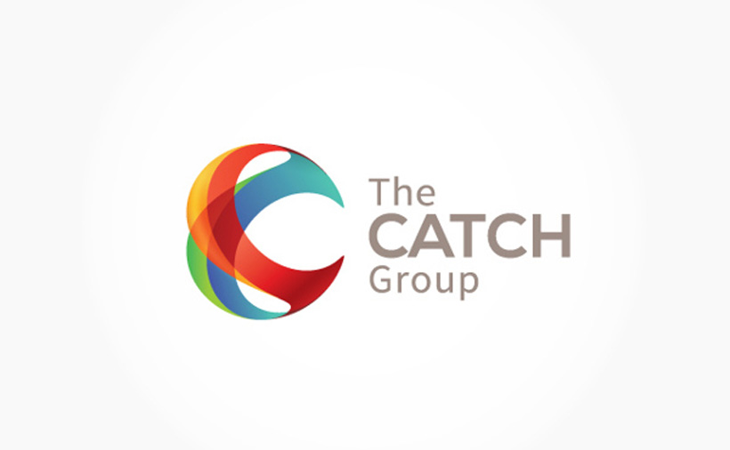
Combination Logo
- The combination logo is the safest bet when it comes to establishing brand identity. A symbol, accompanied by a name, produces a lasting impression on the mind. Even legal experts agree, that from the point of view of trademarking your brand logo, a combination logo is the way to go. Here are some great examples of combination logos that we cam across.


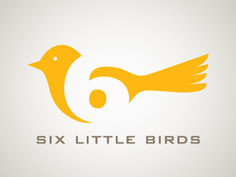
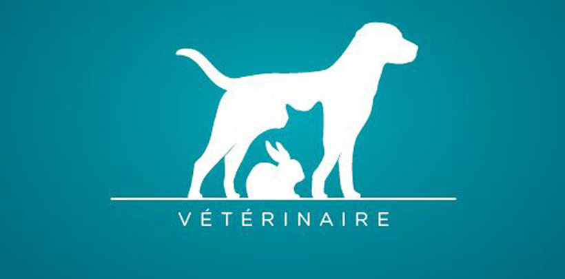
Negative Space
- While it may not apply to every situation, the use of negative space in a logo produces an engaging effect that is sure to ensure retention. It requires very clever manipulation and but the result is a logo that not only stands out but also will momentarily perplex the viewer, forcing him to pay more attention. Below are some great examples of the use of negative space in a logo.

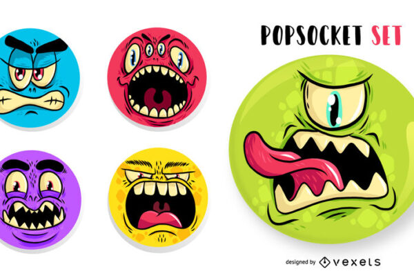
Food Writers
![]()
![]()
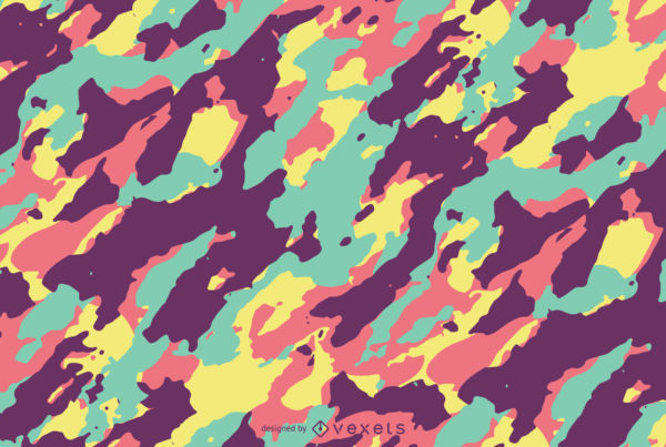
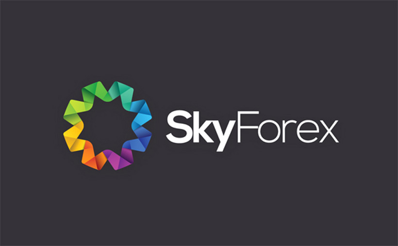
Low Poly Design
- On of the latest trends to make its mark in the year 2014 is the low poly design. Attractive, pleasing and unique, it hits all the right spots of the viewer’s mind. The sheer flexibility in design that this style allows is a great advantage in its favour. A design like this instantly sets apart your brand logo as fresh, young and vibrant. If those qualities characterise your brand, Low poly design might be the perfect choice for you. Scroll down to see some cool logos.
![]()
![]()


![]()
Wordmark Logo
- Nothing says timeless and classic like a word mark logo. Coca Cola’s word mark logo has not changed in almost a century and still retains its freshness. Its a good choice to include the brand’s name in the logo to increase recognition. If longevity is what you are looking for, word mark logo might be the way to go!
![]()
![]()


- In the end, whatever design you choose, remember to keep it simple. Simple designs last ages. We would love to hear your thoughts on this post so drop a comments below. And remember to keep coming back for more inspirational nuggets.