In this post, we are going to analyze what to take into consideration when you choose a Poster template.
Nowadays it’s easier than ever to design a good poster that achieves its goals without design skills. It doesn’t matter if it is a poster to announce a show, to attract customers, or a science poster to show your investigation qualities.
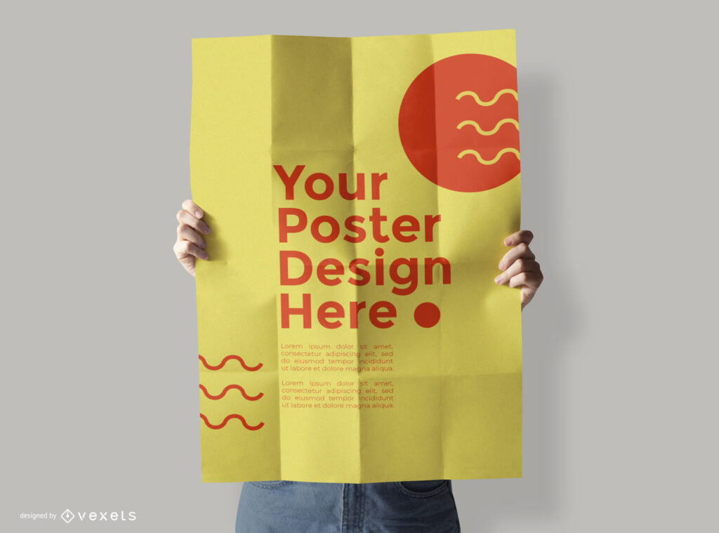
In case that you want to save time or don’t have design skills, you don’t need to create your poster from scratch. In little-to-no-time, you can use a poster template and have a very professional finished poster.
There are some important things to consider when choosing the right template.
1 Always have your goal in mind
You need to have a clear goal for the poster. Not only what you want to show in it, but more important is also what is your poster for. Depending on the purpose you will need a kind of design or another.
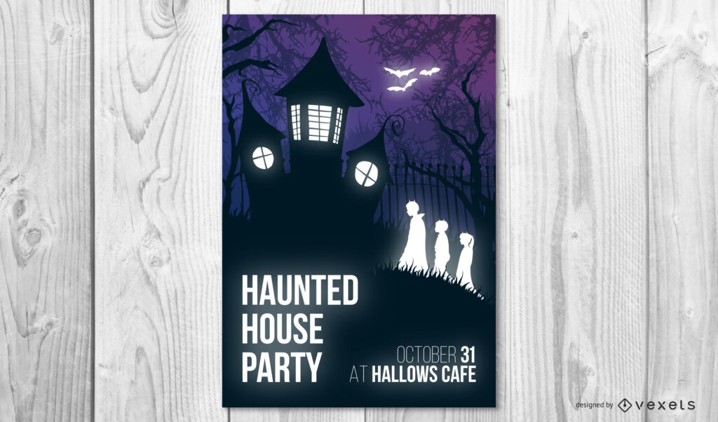
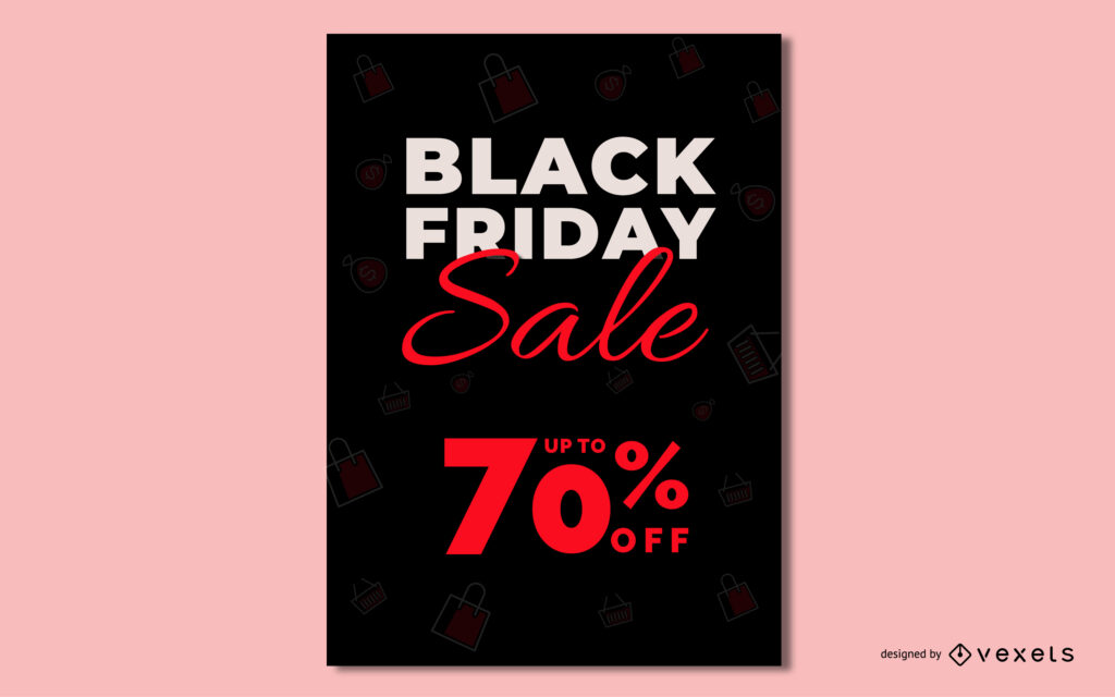
For instance, if you want your poster to be a claim for a theater production, it will be necessary to show the title very clearly and the appearance that fits the play, as well as feature the dates and address for your audience to come.
2 Use Colors Wisely
The color palette of your poster must fit the color identity of your message.
If you are designing a company-related poster, it’s easier if the main color is defined, but if you don’t have one, invest a little time in choosing an adequate one.
Then you can find out the secondary colors using one of the options that are described in the color theory. You can use analogous colors to define the palette, also triad colors or complementary depending on the feel you want your poster to have.
You can use tools like the color wheel from Adobe to detail the colors of your poster design.
3 Where will the poster be shown
To decide the composition and size of the elements of the poster it’s important to know where it will be featured.
The distance of the viewer and the quantity of information to share will affect the composition of the poster. If possible, consider the colors and light of the surroundings where the poster will be exposed to make it pop up.
4 Images or text?
Is it better to have a lettering-based poster or an image-based one? It all depends on what’s best to deliver your message.
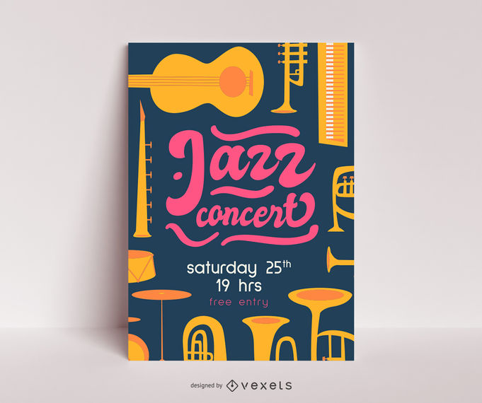
You can get different effects only by changing typographies or combining some. Remember, do not use many fonts at the same time in the poster. It might be confusing.
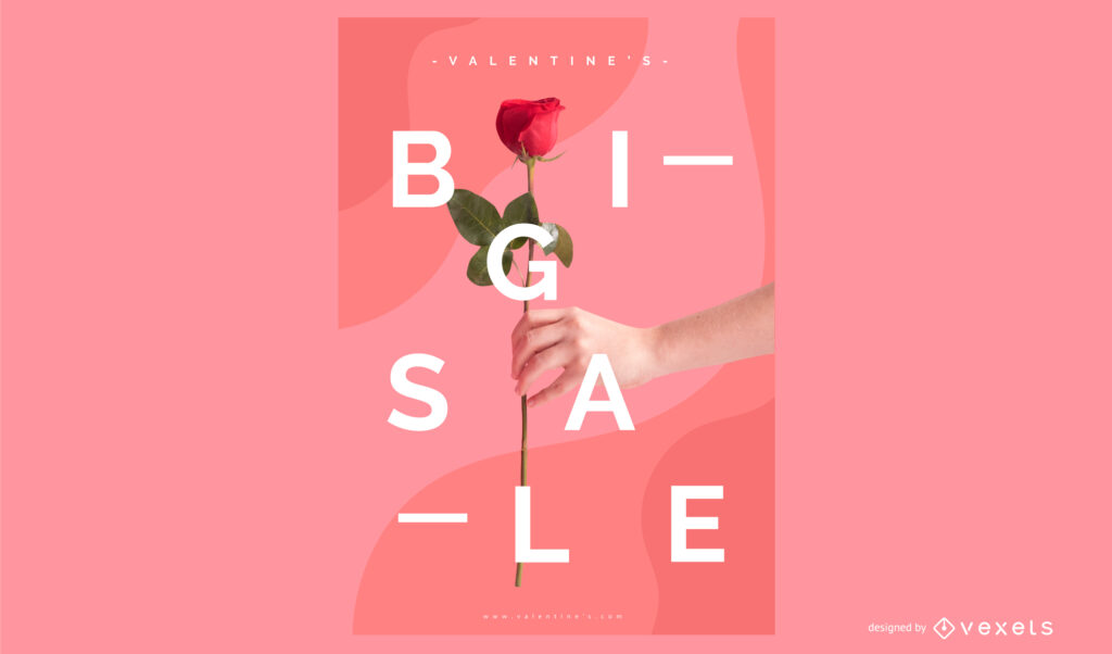
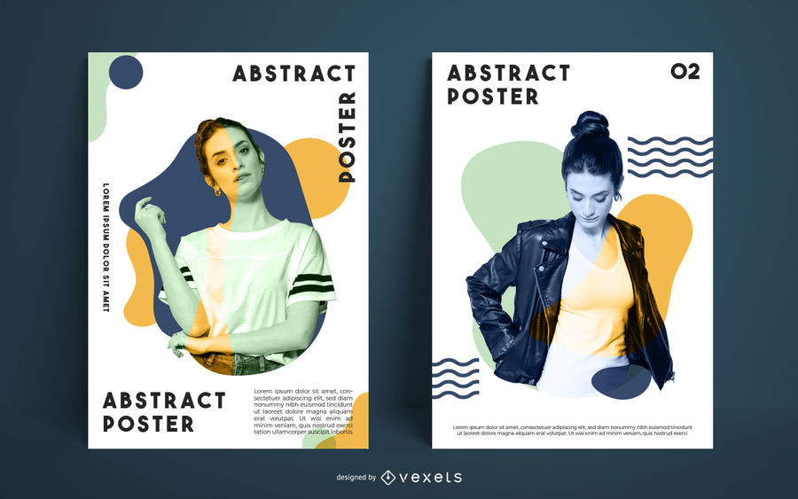
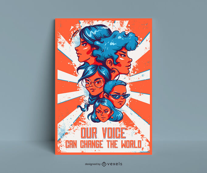
Also, one big image is a fantastic tool to catch the eye. It doesn’t care if it’s a real image, a composition, or an illustration, showing a big image in the center of the poster will help viewers to fix it in the memory.
5 Call to action
The most important thing is to be sure that the call to action of your poster is clear and visible. Linking with the first tip in this post, remember the purpose of your poster and make it easy to find.
One usual technique is to make it contrast with the rest of the design by using different Typography or a complementary color.
Considering these easy 5 tips and browsing the vast library of editable designs we offer we are sure you can find a suitable Poster template for your project.
You can choose among editable templates, editable text templates, and poster mockups to find out exactly what you need

")