Are you ready to create a unique logo for your business or organisation? This can be pretty exciting especially when launching something new or even when finally establishing a logo design for an already existing idea. While the excitement and enthusiasm is a pretty good start, it is however not enough. You will still need a good understanding of what exactly goes into the making of a logo. Put briefly, a logo should contain a design, style choice and color palette that represents the brand’s identity and personality. This will help you to come up with something that is both visually appealing as well as sensible. Remember that this logo will forever be associated with your brand hence the need to consider both the current state of the business or organisation as well as its prospects. This will ensure that all designs are in line with the vision and will, therefore, stay relevant in the future.
Entrepreneurs in the modern business environment have the advantage of making use of all these modern innovations in communication, designing and just general logistics when growing their businesses. Logo template designs are one such useful tooling that can make the life of a business owner much easier. These logos no longer need complex software and design experts to create and perfect. You can easily put together your unique logo using innovative logo design templates from graphic solutions providers such as Vexels online. This, therefore, leaves you to focus only on the details to include n your logo design which will enable it to serve the purpose. Speaking of which, the main purpose of logos is simply to uniquely identify products or services of a particular brand.
Logo Styles
Our society is pretty much fascinated with the freedom of choice that comes with civilization. Logo styles are no exception to this need. They come in various forms, each with its own merits and demerits. Business owners, therefore, have the liberty to pick a style that resonates the most with their interests. Of course, more goes into this decision such as the type of the business being branded and the vibe or aura being aimed for. Most important of all, the choice of logo styles should always take into considerations the associated pros and cons and whether the business and live with them. Let’s take a quick look at some of the main logo styles available from graphics gurus like Vexels:
Wordmarks
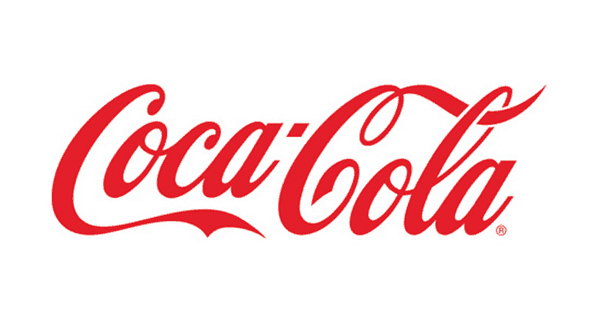
This category can also be referred to as logotypes. It is a font-based logo with the central attention being on the name of the business itself. The name is therefore transformed into a distinct Logo through font manipulation with a great example of this being the Coca-Cola Company.
Wordmarks are ideal for brands with unique names that stand out among regular words or names. They are often desirable since they popularize the actual company name through the brand logo directly and are generally easy to remember when as long as the company name is pretty distinct itself such as Google. As such, new businesses can ideally use this logo style or as long as the name is short and distinct as well as easy to spell out. Just make sure you use a killer font!
Monograms
This logo style is also referred to as Lettermarks. It is simply composed of Letters that are often the initials of the Company’s name. Monograms come in handy where the name of the company is too long or too complex to spell out for instance simply using ‘NASA’ as a logo instead of the full name ‘National Aeronautics and Space Administration’. Many other popular companies such as IBM and HBO have utilized this logo style quite successfully.
Monograms have the obvious advantage of lessening the effort for the customers of the business to learn the name. Simple initials such as HBO are pretty easy to remember and they roll off the tongue quite easily. They also make the logo design quite simple and easily visible with a lot of design possibilities in terms of the arrangement, orientation etc.
Pictorial Marks
Pictorial marks are also known as logo symbols and they are icons or graphics-based logos. These utilize a uniquely designed image which is synonymous with the name of the brand such as in the case of Apple which conveniently used an apple graphic as its logo or Twitter which made the blue bird image it’s brand logo.
This category is a bit tougher to establish since there’s a need for the audience to first of all be familiar with the name of the company being associated with the graphical brand logo since the image is meant to spark recognition on its own without any text. It’s often ideal to have a graphic image that is related to the actual name as in the two examples given already. Despite being difficult to establish, pictorial marks are very dominant and promote easy recognition since people generally recognize images much faster than they recognize words or letters.
Abstract Marks
This style is both unique and intriguing. Abstract marks are non-specific pictorial logos whose images do not necessarily resemble any ordinary feature, design or shape. A good example of this logo style is that of Pepsi and Adidas. They are often created from random and imaginative designs or modifications of letters or names that have become unrecognizable yet still stylish and visually appealing.
Abstract marks are therefore pretty unique and ensure that products of that brand can be easily distinguished from among others however they may be difficult to establish for the newer brands and smaller companies.
Combination Marks
This logo style comprises of unique combinations of either a wordmark or lettermark with a graphical symbol or an abstract design. These can be arranged in any manner either independently or unionized together to form one single logo element. A great example of such a style is the Doritos logo.
Combination marks provide a bridge between full-font and full-graphics designs hence provide a versatile compromise for brands that are looking to benefit from both these categories of logo designs. They are therefore ideal as well for newer brands seeking to establish themselves as well as older brands wishing to fuse their brand logos and brand names into a single unit.
Emblems
Emblems are also a common logo-design. They can easily be fabricated using logo templates customized to suit a particular company name. Emblems are essentially fonts, lettering or graphics inside a symbol or an icon. They are common with badge designs for institutions such as schools like Harvard and car manufacturers such as Toyota.
Emblems are quite often visually appealing due to the combination of several graphical units. This works to the benefit of the company. They are however often intrinsic and do not easily display or inform about the actual name of the company hence they may take a while to establish properly. Since emblems are often uniquely designed, they are best with very large logos that are easily visible since any scaling or resizing can easily make them illegible.
Mascots
Last but not least, let’s look at the Mascot logo style which represents illustrated characters, often with very colorful or creative designs for extra visual effects. The goal of this logo style is to attract intense attention in a funny manner that can win affection easily. It’s therefore often employed for brands targeted at the younger generations such as cereals and toy brands as well as fast food companies.
Some of the most successful mascot logos include KFC and Kool-Aid. Mascots are however often not the exclusive logo for the brand but rather a cool way of attracting attention to the brand such as in the case of KFC which has a cartoonish Mascot and a Lettermark as part of its logo ensemble.
Color Palette
The color palette used for the logo design is pretty essential, it is just as important as the designated logo style itself! Whether it’s a commercial use logo or just a personal brand, the colors should always appeal to the viewer harmoniously. Logo templates are handy in this manner as they offer the ideal color combinations for the best overall look for all logo styles possible.
In conclusion, the logo style employed during the design process is bound to give your brand a unique and quite distinct aura that is discernible to your clients. As such, logos designed with different styles can provoke different responses from the same observer. This means that your logo is the first chance that you to make a good impression and entice your audience to interact with you more. It’s therefore always a good idea to test-run any design on a few individuals before rolling it out to the public. This will help you to figure out people’s reactions to it as well as identify any missing necessary components to it that your beta group notices. Using logo templates can also help you to ensure that nothing is ever found missing since they always contain all the necessary provisions for a great logo!